Chapter 1: Introduction
Contents
Chapter 1: Introduction#
import pandas as pd
import numpy as np
import matplotlib.pyplot as plt
import seaborn as sns
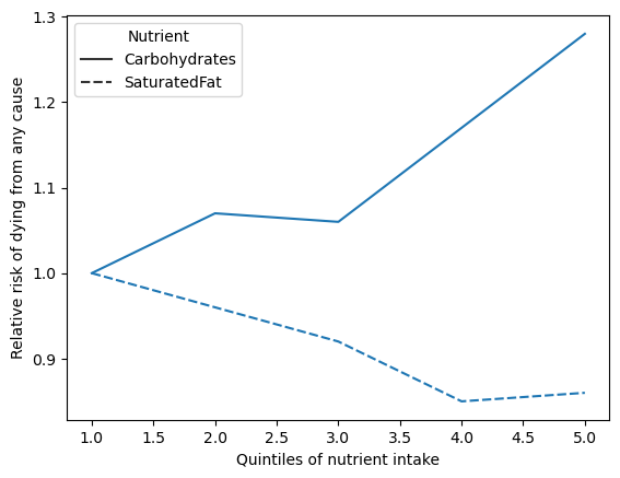
Figure 1.1#
df = pd.DataFrame({'Carbohydrates': [1, 1.07, 1.06, 1.17, 1.28],
                   'SaturatedFat': [1, 0.96, 0.92, 0.85, 0.86],
                  'Quartile': np.arange(1,6)})
df_long = pd.melt(df, id_vars='Quartile',
                  value_vars = ['Carbohydrates' , 'SaturatedFat'],
                  var_name='Nutrient')


sns.lineplot(x='Quartile', y='value', style='Nutrient', data=df_long)
plt.ylabel('Relative risk of dying from any cause')
plt.xlabel('Quintiles of nutrient intake')
Text(0.5, 0, 'Quintiles of nutrient intake')