Chapter 5 Fitting models to data
One of the fundamental activities in statistics is creating models that can summarize data using a small set of numbers, thus providing a compact description of the data. In this chapter we will discuss the concept of a statistical model and how it can be used to describe data.
5.1 What is a model?
In the physical world, “models” are generally simplifications of things in the real world that nonetheless convey the essence of the thing being modeled. A model of a building conveys the structure of the building while being small and light enough to pick up with one’s hands; a model of a cell in biology is much larger than the actual thing, but again conveys the major parts of the cell and their relationships.
In statistics, a model is meant to provide a similarly condensed description, but for data rather than for a physical structure. Like physical models, a statistical model is generally much simpler than the data being described; it is meant to capture the structure of the data as simply as possible. In both cases, we realize that the model is a convenient fiction that necessarily glosses over some of the details of the actual thing being modeled. As the statistician George Box famously said: “All models are wrong but some are useful.” It can also be useful to think of a statistical model as a theory of how the observed data were generated; our goal then becomes to find the model that most efficiently and accurately summarizes the way in which the data were actually generated. But as we will see below, the desires of efficiency and accuracy will often be diametrically opposed to one another.
The basic structure of a statistical model is:
\[ data = model + error \]
This expresses the idea that the data can be broken into two portions: one portion that is described by a statistical model, which expresses the values that we expect the data to take given our knowledge, and another portion that we refer to as the error that reflects the difference between the model’s predictions and the observed data.
In essence we would like to use our model to predict the value of the data for any given observation. We would write the equation like this:
\[ \widehat{data_i} = model_i \] The “hat” over the data denotes that it’s our prediction rather than the actual value of the data.This means that the predicted value of the data for observation \(i\) is equal to the value of the model for that observation. Once we have a prediction from the model, we can then compute the error:
\[ error_i = data_i - \widehat{data_i} \] That is, the error for any observation is the difference between the observed value of the data and the predicted value of the data from the model.
5.2 Statistical modeling: An example
Let’s look at an example of building a model for data, using the data from NHANES. In particular, we will try to build a model of the height of children in the NHANES sample. First let’s load the data and plot them (see Figure 5.1).
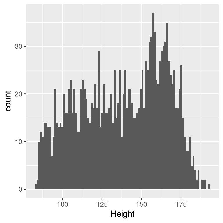
Figure 5.1: Histogram of height of children in NHANES.
Remember that we want to describe the data as simply as possible while still capturing their important features. The simplest model that we can imagine would involve only a single number; that is, the model would predict the same value for each observation, regardless of what else we might know about those observations. We generally describe a model in terms of its parameters, which are values that we can change in order to modify the predictions of the model. Throughout the book we will refer to these using the Greek letter beta (\(\beta\)); when the model has more than one parameter, we will use subscripted numbers to denote the different betas (e.g. \(\beta_1\)). It’s also customary to refer to the values of the data using the letter \(y\), and to use a subscripted version \(y_i\) to refer to the individual observations.
We generally don’t know the true values of the parameters, so we have to estimate them from the data. For this reason, we will generally put a “hat” over the \(\beta\) symbol to denote that we are using an estimate of the parameter value rather than its true value (which we generally don’t know). Thus, our simple model for height using a single parameter would be:
\[ y_i = \beta + \epsilon \]
The subscript \(i\) doesn’t appear on the right side of the equation, which means that the prediction of the model doesn’t depend on which observation we are looking at — it’s the same for all of them. The question then becomes: how do we estimate the best values of the parameter(s) in the model? In this particular case, what single value is the best estimate for \(\beta\)? And, more importantly, how do we even define best?
One very simple estimator that we might imagine is the mode, which is simply the most common value in the dataset. This redescribes the entire set of 1691 children in terms of a single number. If we wanted to predict the height of any new children, then our predicted value would be the same number:
\[ \hat{y_i} = 166.5 \] The error for each individual would then be the difference between the predicted value (\(\hat{y_i}\)) and their actual height (\(y_i\)):
\[ error_i = y_i - \hat{y_i} \]
How good of a model is this? In general we define the goodness of a model in terms of the magnitude of the error, which represents the degree to which the data diverge from the model’s predictions; all things being equal, the model that produces lower error is the better model. (Though as we will see later, all things are usually not equal…) What we find in this case is that the average individual has a fairly large error of -28.8 centimeters when we use the mode as our estimator for \(\beta\), which doesn’t seem very good on its face.
How might we find a better estimator for our model parameter? We might start by trying to find an estimator that gives us an average error of zero. One good candidate is the arithmetic mean (that is, the average, often denoted by a bar over the variable, such as \(\bar{X}\)), computed as the sum of all of the values divided by the number of values. Mathematically, we express this as:
\[ \bar{X} = \frac{\sum_{i=1}^{n}x_i}{n} \]
It turns out that if we use the arithmetic mean as our estimator then the average error will indeed be zero (see the simple proof at the end of the chapter if you are interested). Even though the average of errors from the mean is zero, we can see from the histogram in Figure 5.2 that each individual still has some degree of error; some are positive and some are negative, and those cancel each other out to give an average error of zero.
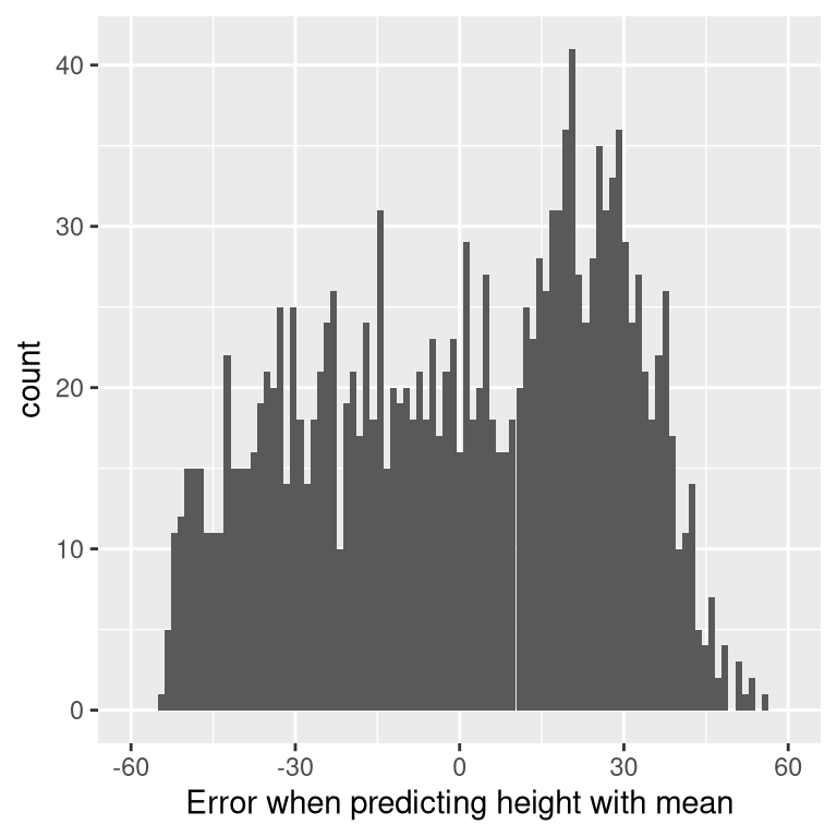
Figure 5.2: Distribution of errors from the mean.
The fact that the negative and positive errors cancel each other out means that two different models could have errors of very different magnitude in absolute terms, but would still have the same average error. This is exactly why the average error is not a good criterion for our estimator; we want a criterion that tries to minimize the overall error regardless of its direction. For this reason, we generally summarize errors in terms of some kind of measure that counts both positive and negative errors as bad. We could use the absolute value of each error value, but it’s more common to use the squared errors, for reasons that we will see later in the book.
There are several common ways to summarize the squared error that you will encounter at various points in this book, so it’s important to understand how they relate to one another. First, we could simply add them up; this is referred to as the sum of squared errors. The reason we don’t usually use this is that its magnitude depends on the number of data points, so it can be difficult to interpret unless we are looking at the same number of observations. Second, we could take the mean of the squared error values, which is referred to as the mean squared error (MSE). However, because we squared the values before averaging, they are not on the same scale as the original data; they are in \(centimeters^2\). For this reason, it’s also common to take the square root of the MSE, which we refer to as the root mean squared error (RMSE), so that the error is measured in the same units as the original values (in this example, centimeters).
The mean has a pretty substantial amount of error – any individual data point will be about 27 cm from the mean on average – but it’s still much better than the mode, which has a root mean squared error of about 39 cm.
5.2.1 Improving our model
Can we imagine a better model? Remember that these data are from all children in the NHANES sample, who vary from 2 to 17 years of age. Given this wide age range, we might expect that our model of height should also include age. Let’s plot the data for height against age, to see if this relationship really exists.
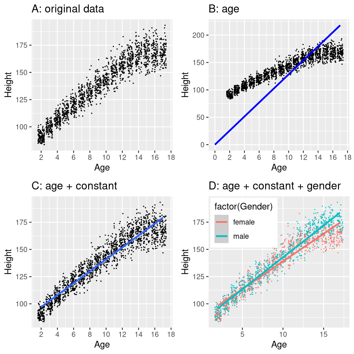
Figure 5.3: Height of children in NHANES, plotted without a model (A), with a linear model including only age (B) or age and a constant (C), and with a linear model that fits separate effects of age for males and females (D).
The black points in Panel A of Figure 5.3 show individuals in the dataset, and there seems to be a strong relationship between height and age, as we would expect. Thus, we might build a model that relates height to age:
\[ \hat{y_i} = \hat{\beta} * age_i \]
where \(\hat{\beta}\) is our estimate of the parameter that we multiply by age to generate the model prediction.
You may remember from algebra that a line is defined as follows:
\[ y = slope*x + intercept \]
If age is the \(X\) variable, then that means that our prediction of height from age will be a line with a slope of \(\beta\) and an intercept of zero - to see this, let’s plot the best fitting line in blue on top of the data (Panel B in Figure 5.3). Something is clearly wrong with this model, as the line doesn’t seem to follow the data very well. In fact, the RMSE for this model (39.16) is actually higher than the model that only includes the mean! The problem comes from the fact that our model only includes age, which means that the predicted value of height from the model must take on a value of zero when age is zero. Even though the data do not include any children with an age of zero, the line is mathematically required to have a y-value of zero when x is zero, which explains why the line is pulled down below the younger datapoints. We can fix this by including an intercept in our model, which basically represents the estimated height when age is equal to zero; even though an age of zero is not plausible in this dataset, this is a mathematical trick that will allow the model to account for the overall magnitude of the data. The model is:
\[ \widehat{y_i} = \hat{\beta_0} + \hat{\beta_1} * age_i \]
where \(\hat{\beta_0}\) is our estimate for the intercept, which is a constant value added to the prediction for each individual; we call it the intercept because it maps onto the intercept in the equation for a straight line. We will learn later how it is that we actually estimate these parameter values for a particular dataset; for now, we will use our statistical software to estimate the parameter values that give us the smallest error for these particular data. Panel C in Figure 5.3 shows this model applied to the NHANES data, where we see that the line matches the data much better than the one without a constant.
Our error is much smaller using this model – only 8.36 centimeters on average. Can you think of other variables that might also be related to height? What about gender? In Panel D of Figure 5.3 we plot the data with lines fitted separately for males and females. From the plot, it seems that there is a difference between males and females, but it is relatively small and only emerges after the age of puberty. In Figure 5.4 we plot the root mean squared error values across the different models, including one with an additional parameter that models the effect of gender. From this we see that the model got a little bit better going from mode to mean, much better going from mean to mean + age, and only very slightly better by including gender as well.
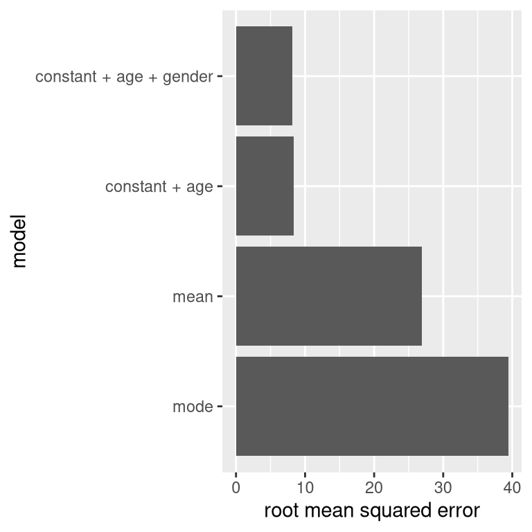
Figure 5.4: Mean squared error plotted for each of the models tested above.
5.3 What makes a model “good”?
There are generally two different things that we want from our statistical model. First, we want it to describe our data well; that is, we want it to have the lowest possible error when modeling our data. Second, we want it to generalize well to new datasets; that is, we want its error to be as low as possible when we apply it to a new dataset in order to make a prediction. It turns out that these two features can often be in conflict.
To understand this, let’s think about where error comes from. First, it can occur if our model is wrong; for example, if we inaccurately said that height goes down with age instead of going up, then our error will be higher than it would be for the correct model. Similarly, if there is an important factor that is missing from our model, that will also increase our error (as it did when we left age out of the model for height). However, error can also occur even when the model is correct, due to random variation in the data, which we often refer to as “measurement error” or “noise”. Sometimes this really is due to error in our measurement – for example, when the measurements rely on a human, such as using a stopwatch to measure elapsed time in a footrace. In other cases, our measurement device is highly accurate (like a digital scale to measure body weight), but the thing being measured is affected by many different factors that cause it to be variable. If we knew all of these factors then we could build a more accurate model, but in reality that’s rarely possible.
Let’s use an example to show this. Rather than using real data, we will generate some data for the example using a computer simulation (about which we will have more to say in a few chapters). Let’s say that we want to understand the relationship between a person’s blood alcohol content (BAC) and their reaction time on a simulated driving test. We can generate some simulated data and plot the relationship (see Panel A of Figure 5.5).
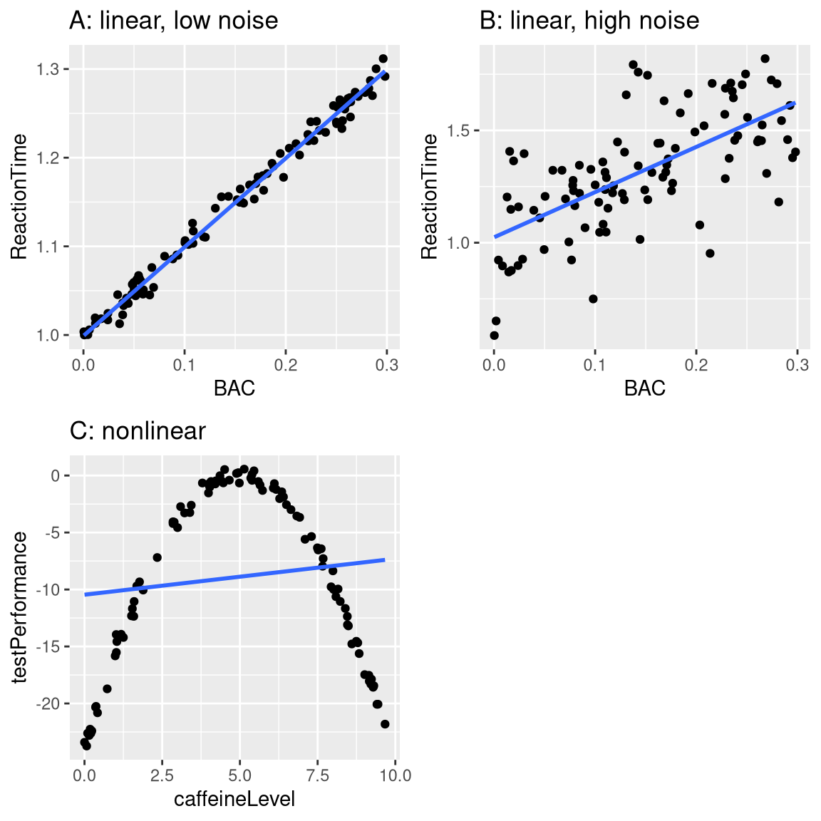
Figure 5.5: Simulated relationship between blood alcohol content and reaction time on a driving test, with best-fitting linear model represented by the line. A: linear relationship with low measurement error. B: linear relationship with higher measurement error. C: Nonlinear relationship with low measurement error and (incorrect) linear model
In this example, reaction time goes up systematically with blood alcohol content – the line shows the best fitting model, and we can see that there is very little error, which is evident in the fact that all of the points are very close to the line.
We could also imagine data that show the same linear relationship, but have much more error, as in Panel B of Figure 5.5. Here we see that there is still a systematic increase of reaction time with BAC, but it’s much more variable across individuals.
These were both examples where the relationship between the two variables appears to be linear, and the error reflects noise in our measurement. On the other hand, there are other situations where the relationship between the variables is not linear, and error will be increased because the model is not properly specified. Let’s say that we are interested in the relationship between caffeine intake and performance on a test. The relation between stimulants like caffeine and test performance is often nonlinear - that is, it doesn’t follow a straight line. This is because performance goes up with smaller amounts of caffeine (as the person becomes more alert), but then starts to decline with larger amounts (as the person becomes nervous and jittery). We can simulate data of this form, and then fit a linear model to the data (see Panel C of Figure 5.5). The blue line shows the straight line that best fits these data; clearly, there is a high degree of error. Although there is a very lawful relation between test performance and caffeine intake, it follows a curve rather than a straight line. The model that assumes a linear relationship has high error because it’s the wrong model for these data.
5.4 Can a model be too good?
Error sounds like a bad thing, and usually we will prefer a model that has lower error over one that has higher error. However, we mentioned above that there is a tension between the ability of a model to accurately fit the current dataset and its ability to generalize to new datasets, and it turns out that the model with the lowest error often is much worse at generalizing to new datasets!
To see this, let’s once again generate some data so that we know the true relation between the variables. We will create two simulated datasets, which are generated in exactly the same way – they just have different random noise added to them. That is, the equation for both of them is \(y = \beta * X + \epsilon\); the only difference is that different random noise was used for \(\epsilon\) in each case.
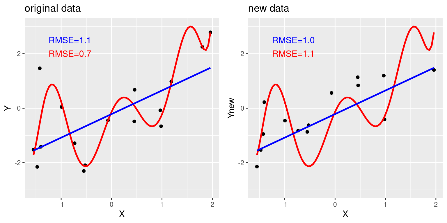
Figure 5.6: An example of overfitting. Both datasets were generated using the same model, with different random noise added to generate each set. The left panel shows the data used to fit the model, with a simple linear fit in blue and a complex (8th order polynomial) fit in red. The root mean square error (RMSE) values for each model are shown in the figure; in this case, the complex model has a lower RMSE than the simple model. The right panel shows the second dataset, with the same model overlaid on it and the RMSE values computed using the model obtained from the first dataset. Here we see that the simpler model actually fits the new dataset better than the more complex model, which was overfitted to the first dataset.
The left panel in Figure 5.6 shows that the more complex model (in red) fits the data better than the simpler model (in blue). However, we see the opposite when the same model is applied to a new dataset generated in the same way – here we see that the simpler model fits the new data better than the more complex model. Intuitively, we can see that the more complex model is influenced heavily by the specific data points in the first dataset; since the exact position of these data points was driven by random noise, this leads the more complex model to fit badly on the new dataset. This is a phenomenon that we call overfitting. For now it’s simply important to keep in mind that our model fit needs to be good, but not too good. As Albert Einstein (1933) said: “It can scarcely be denied that the supreme goal of all theory is to make the irreducible basic elements as simple and as few as possible without having to surrender the adequate representation of a single datum of experience.” Which is often paraphrased as: “Everything should be as simple as it can be, but not simpler.”
5.5 Summarizing data using the mean
We have already encountered the mean (or average) above, and in fact most people know about the average even if they have never taken a statistics class. It is commonly used to describe what we call the “central tendency” of a dataset – that is, what value are the data centered around? Most people don’t think of computing a mean as fitting a model to data. However, that’s exactly what we are doing when we compute the mean.
We have already seen the formula for computing the mean of a sample of data:
\[ \bar{X} = \frac{\sum_{i=1}^{n}x_i}{n} \]
Note that I said that this formula was specifically for a sample of data, which is a set of data points selected from a larger population. Using a sample, we wish to characterize a larger population – the full set of individuals that we are interested in. For example, if we are a political pollster our population of interest might be all registered voters, whereas our sample might just include a few thousand people sampled from this population. In Chapter 7 we will talk in more detail about sampling, but for now the important point is that statisticians generally like to use different symbols to differentiate statistics that describe values for a sample from parameters that describe the true values for a population; in this case, the formula for the population mean (denoted as \(\mu\)) is:
\[ \mu = \frac{\sum_{i=1}^{N}x_i}{N} \] where N is the size of the entire population.
We have already seen that the mean is the estimator that is guaranteed to give us an average error of zero, but we also learned that the average error is not the best criterion; instead, we want an estimator that gives us the lowest sum of squared errors (SSE), which the mean also does. We could prove this using calculus, but instead we will demonstrate it graphically in Figure 5.7.
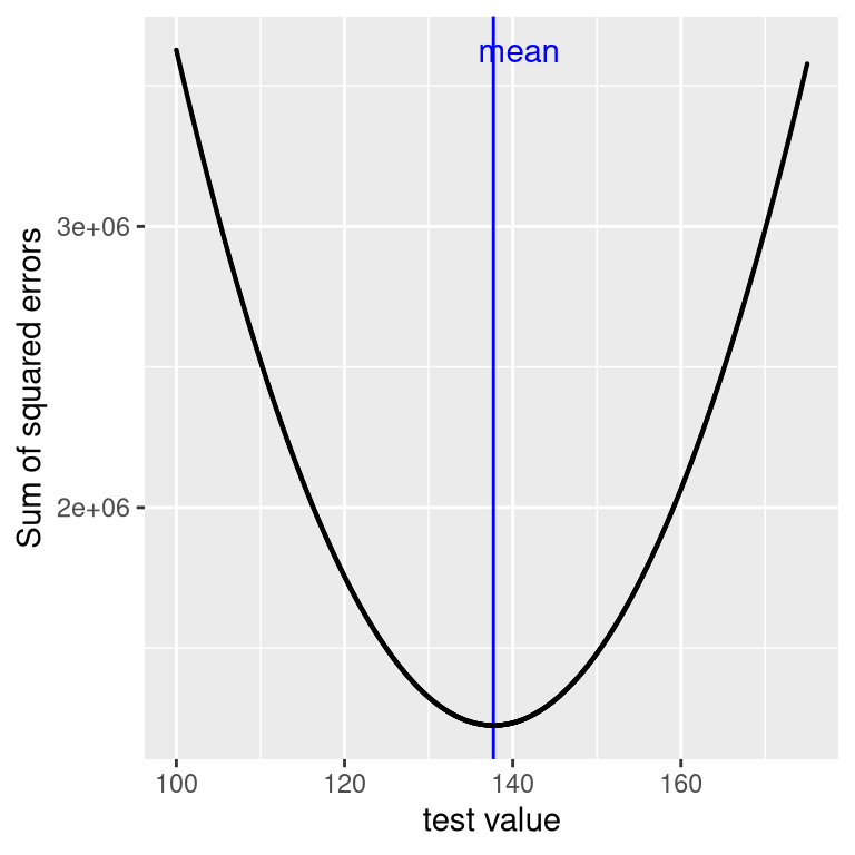
Figure 5.7: A demonstration of the mean as the statistic that minimizes the sum of squared errors. Using the NHANES child height data, we compute the mean (denoted by the blue bar). Then, we test a range of possible parameter estimates, and for each one we compute the sum of squared errors for each data point from that value, which are denoted by the black curve. We see that the mean falls at the minimum of the squared error plot.
This minimization of SSE is a good feature, and it’s why the mean is the most commonly used statistic to summarize data. However, the mean also has a dark side. Let’s say that five people are in a bar, and we examine each person’s income (Table 5.1):
| income | person |
|---|---|
| 48000 | Joe |
| 64000 | Karen |
| 58000 | Mark |
| 72000 | Andrea |
| 66000 | Pat |
The mean (61600.00) seems to be a pretty good summary of the income of those five people. Now let’s look at what happens if Beyoncé Knowles walks into the bar (Table 5.2).
| income | person |
|---|---|
| 48000 | Joe |
| 64000 | Karen |
| 58000 | Mark |
| 72000 | Andrea |
| 66000 | Pat |
| 54000000 | Beyonce |
The mean is now almost 10 million dollars, which is not really representative of any of the people in the bar – in particular, it is heavily driven by the outlying value of Beyoncé. In general, the mean is highly sensitive to extreme values, which is why it’s always important to ensure that there are no extreme values when using the mean to summarize data.
5.5.1 Summarizing data robustly using the median
If we want to summarize the data in a way that is less sensitive to outliers, we can use another statistic called the median. If we were to sort all of the values in order of their magnitude, then the median is the value in the middle. If there is an even number of values then there will be two values tied for the middle place, in which case we take the mean (i.e. the halfway point) of those two numbers.
Let’s look at an example. Say we want to summarize the following values:
8 6 3 14 12 7 6 4 9If we sort those values:
3 4 6 6 7 8 9 12 14Then the median is the middle value – in this case, the 5th of the 9 values.
Whereas the mean minimizes the sum of squared errors, the median minimizes a slighty different quantity: The sum of the absolute value of errors. This explains why it is less sensitive to outliers – squaring is going to exacerbate the effect of large errors compared to taking the absolute value. We can see this in the case of the income example: The median income ($65,000) is much more representative of the group as a whole than the mean ($9,051,333), and less sensitive to the one large outlier.
Given this, why would we ever use the mean? As we will see in a later chapter, the mean is the “best” estimator in the sense that it will vary less from sample to sample compared to other estimators. It’s up to us to decide whether that is worth the sensitivity to potential outliers – statistics is all about tradeoffs.
5.6 The mode
Sometimes we wish to describe the central tendency of a dataset that is not numeric. For example, let’s say that we want to know which models of iPhone are most commonly used. To test this, we could ask a large group of iPhone users which model each person owns. If we were to take the average of these values, we might see that the mean iPhone model is 9.51, which is clearly nonsensical, since the iPhone model numbers are not meant to be quantitative measurements. In this case, a more appropriate measure of central tendency is the mode, which is the most common value in the dataset, as we discussed above.
5.7 Variability: How well does the mean fit the data?
Once we have described the central tendency of the data, we often also want to describe how variable the data are – this is sometimes also referred to as “dispersion”, reflecting the fact that it describes how widely dispersed the data are.
We have already encountered the sum of squared errors above, which is the basis for the most commonly used measures of variability: the variance and the standard deviation. The variance for a population (referred to as \(\sigma^2\)) is simply the sum of squared errors divided by the number of observations - that is, it is exactly the same as the mean squared error that you encountered earlier:
\[ \sigma^2 = \frac{SSE}{N} = \frac{\sum_{i=1}^n (x_i - \mu)^2}{N} \]
where \(\mu\) is the population mean. The population standard deviation is simply the square root of this – that is, the root mean squared error that we saw before. The standard deviation is useful because the errors are in the same units as the original data (undoing the squaring that we applied to the errors).
We usually don’t have access to the entire population, so we have to compute the variance using a sample, which we refer to as \(\hat{\sigma}^2\), with the “hat” representing the fact that this is an estimate based on a sample. The equation for \(\hat{\sigma}^2\) is similar to the one for \(\sigma^2\):
\[ \hat{\sigma}^2 = \frac{\sum_{i=1}^n (x_i - \bar{X})^2}{n-1} \]
The only difference between the two equations is that we divide by n - 1 instead of N. This relates to a fundamental statistical concept: degrees of freedom. Remember that in order to compute the sample variance, we first had to estimate the sample mean \(\bar{X}\). Having estimated this, one value in the data is no longer free to vary. For example, let’s say we have the following data points for a variable \(x\): [3, 5, 7, 9, 11], the mean of which is 7. Because we know that the mean of this dataset is 7, we can compute what any specific value would be if it were missing. For example, let’s say we were to obscure the first value (3). Having done this, we still know that its value must be 3, because the mean of 7 implies that the sum of all of the values is \(7 * n = 35\) and \(35 - (5 + 7 + 9 + 11) = 3\).
So when we say that we have “lost” a degree of freedom, it means that there is a value that is not free to vary after fitting the model. In the context of the sample variance, if we don’t account for the lost degree of freedom, then our estimate of the sample variance will be biased, causing us to underestimate the uncertainty of our estimate of the mean.
5.8 Using simulations to understand statistics
I am a strong believer in the use of computer simulations to understand statistical concepts, and in later chapters we will dig more deeply into their use. Here we will introduce the idea by asking whether we can confirm the need to subtract 1 from the sample size in computing the sample variance.
Let’s treat the entire sample of children from the NHANES data as our “population”, and see how well the calculations of sample variance using either \(n\) or \(n-1\) in the denominator will estimate variance of this population, across a large number of simulated random samples from the data. We will return to the details of how to do this in a later chapter.
| Estimate | Value |
|---|---|
| Population variance | 725 |
| Variance estimate using n | 710 |
| Variance estimate using n-1 | 725 |
The results in 5.3 show us that the theory outlined above was correct: The variance estimate using \(n - 1\) as the denominator is very close to the variance computed on the full data (i.e, the population), whereas the variance computed using \(n\) as the denominator is biased (smaller) compared to the true value.
5.9 Z-scores
Having characterized a distribution in terms of its central tendency and variability, it is often useful to express the individual scores in terms of where they sit with respect to the overall distribution. Let’s say that we are interested in characterizing the relative level of crimes across different states, in order to determine whether California is a particularly dangerous place. We can ask this question using data for 2014 from the FBI’s Uniform Crime Reporting site. The left panel of Figure 5.8 shows a histogram of the number of violent crimes per state, highlighting the value for California. Looking at these data, it seems like California is terribly dangerous, with 153709 crimes in that year. We can visualize these data by generating a map showing the distribution of a variable across states, which is presented in the right panel of Figure 5.8.
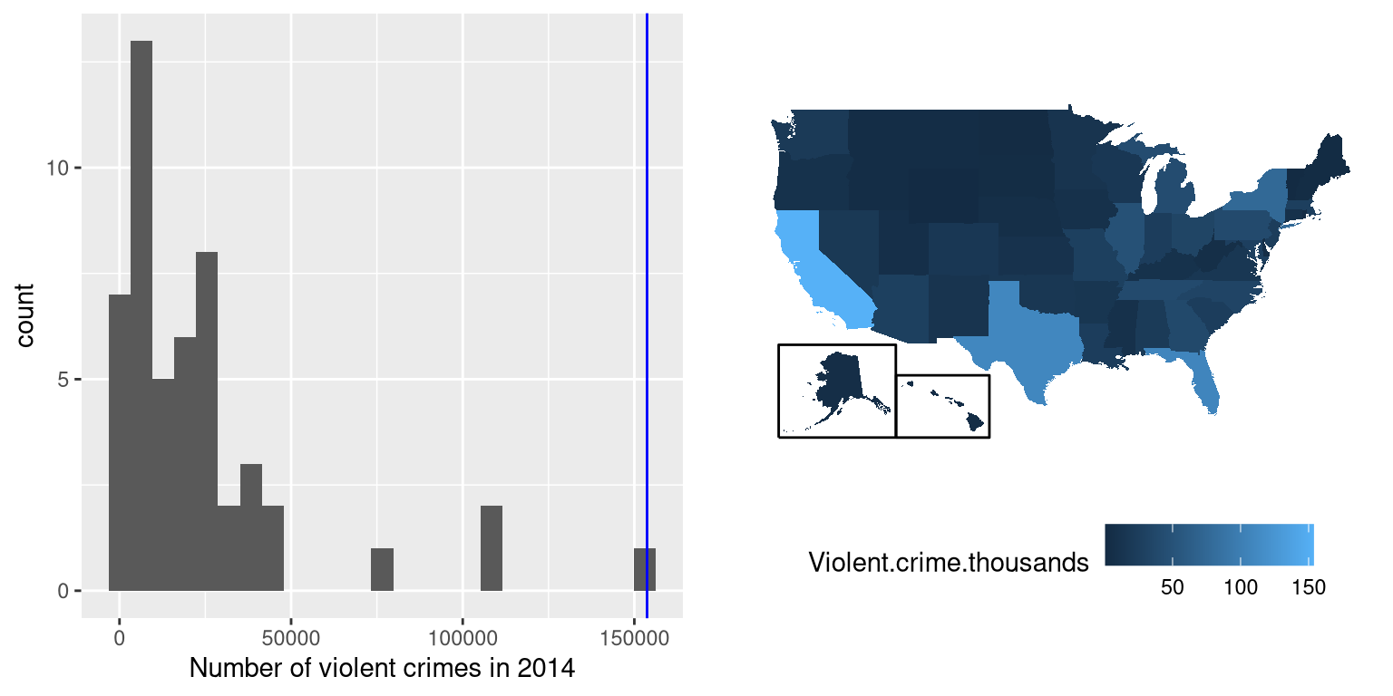
Figure 5.8: Left: Histogram of the number of violent crimes. The value for CA is plotted in blue. Right: A map of the same data, with number of crimes (in thousands) plotted for each state in color.
It may have occurred to you, however, that CA also has the largest population of any state in the US, so it’s reasonable that it will also have a larger number of crimes. If we plot the number of crimes against one the population of each state (see left panel of Figure 5.9), we see that there is a direct relationship between two variables.
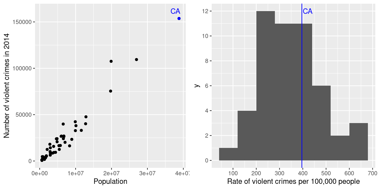
Figure 5.9: Left: A plot of number of violent crimes versus population by state. Right: A histogram of per capita violent crime rates, expressed as crimes per 100,000 people.
Instead of using the raw numbers of crimes, we should instead use the violent crime rate per capita, which we obtain by dividing the number of crimes per state by the population of each state. The dataset from the FBI already includes this value (expressed as rate per 100,000 people). Looking at the right panel of Figure 5.9, we see that California is not so dangerous after all – its crime rate of 396.10 per 100,000 people is a bit above the mean across states of 346.81, but well within the range of many other states. But what if we want to get a clearer view of how far it is from the rest of the distribution?
The Z-score allows us to express data in a way that provides more insight into each data point’s relationship to the overall distribution. The formula to compute a Z-score for an individual data point given that we know the value of the population mean \(\mu\) and standard deviation \(\sigma\) is:
\[ Z(x) = \frac{x - \mu}{\sigma} \]
Intuitively, you can think of a Z-score as telling you how far away any data point is from the mean, in units of standard deviation. We can compute this for the crime rate data, as shown in Figure 5.10, which plots the Z-scores against the original scores.
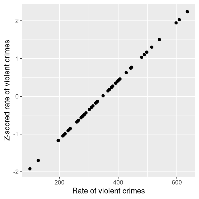
Figure 5.10: Scatterplot of original crime rate data against Z-scored data.
The scatterplot shows us that the process of Z-scoring doesn’t change the relative distribution of the data points (visible in the fact that the orginal data and Z-scored data fall on a straight line when plotted against each other) – it just shifts them to have a mean of zero and a standard deviation of one. Figure 5.11 shows the Z-scored crime data using the geographical view.
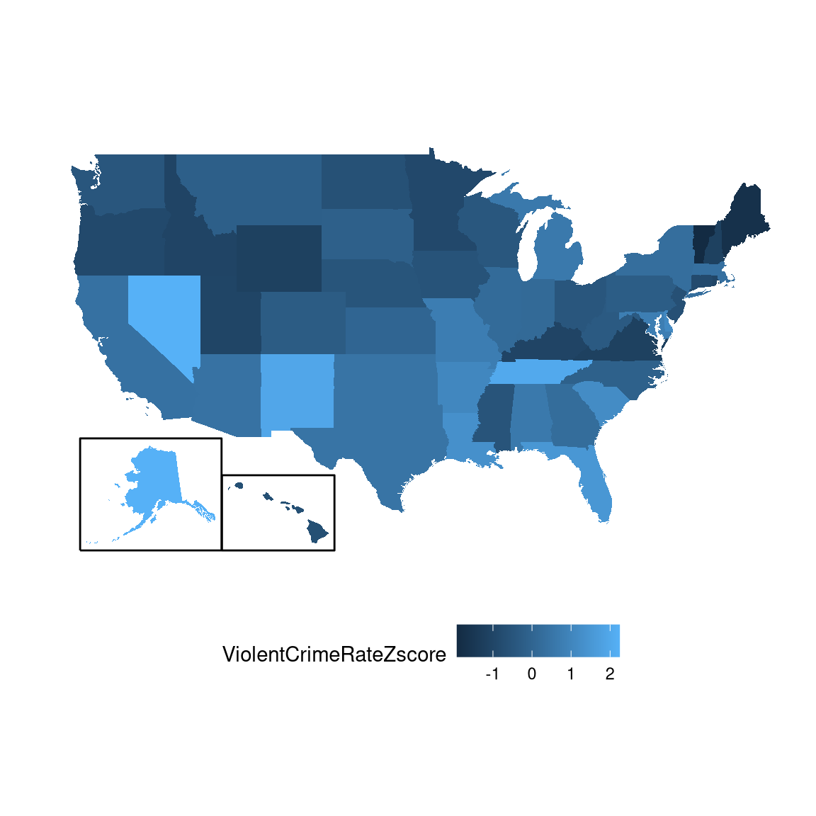
Figure 5.11: Crime data rendered onto a US map, presented as Z-scores.
This provides us with a slightly more interpretable view of the data. For example, we can see that Nevada, Tennessee, and New Mexico all have crime rates that are roughly two standard deviations above the mean.
5.9.1 Interpreting Z-scores
The “Z” in “Z-score” comes from the fact that the standard normal distribution (that is, a normal distribution with a mean of zero and a standard deviation of 1) is often referred to as the “Z” distribution. We can use the standard normal distribution to help us understand what specific Z scores tell us about where a data point sits with respect to the rest of the distribution.
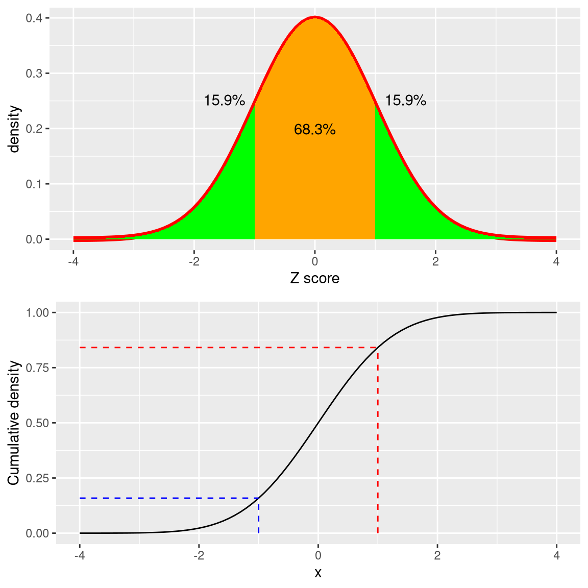
Figure 5.12: Density (top) and cumulative distribution (bottom) of a standard normal distribution, with cutoffs at one standard deviation above/below the mean.
The upper panel in Figure 5.12 shows that we expect about 16% of values to fall in \(Z\ge 1\), and the same proportion to fall in \(Z\le -1\).
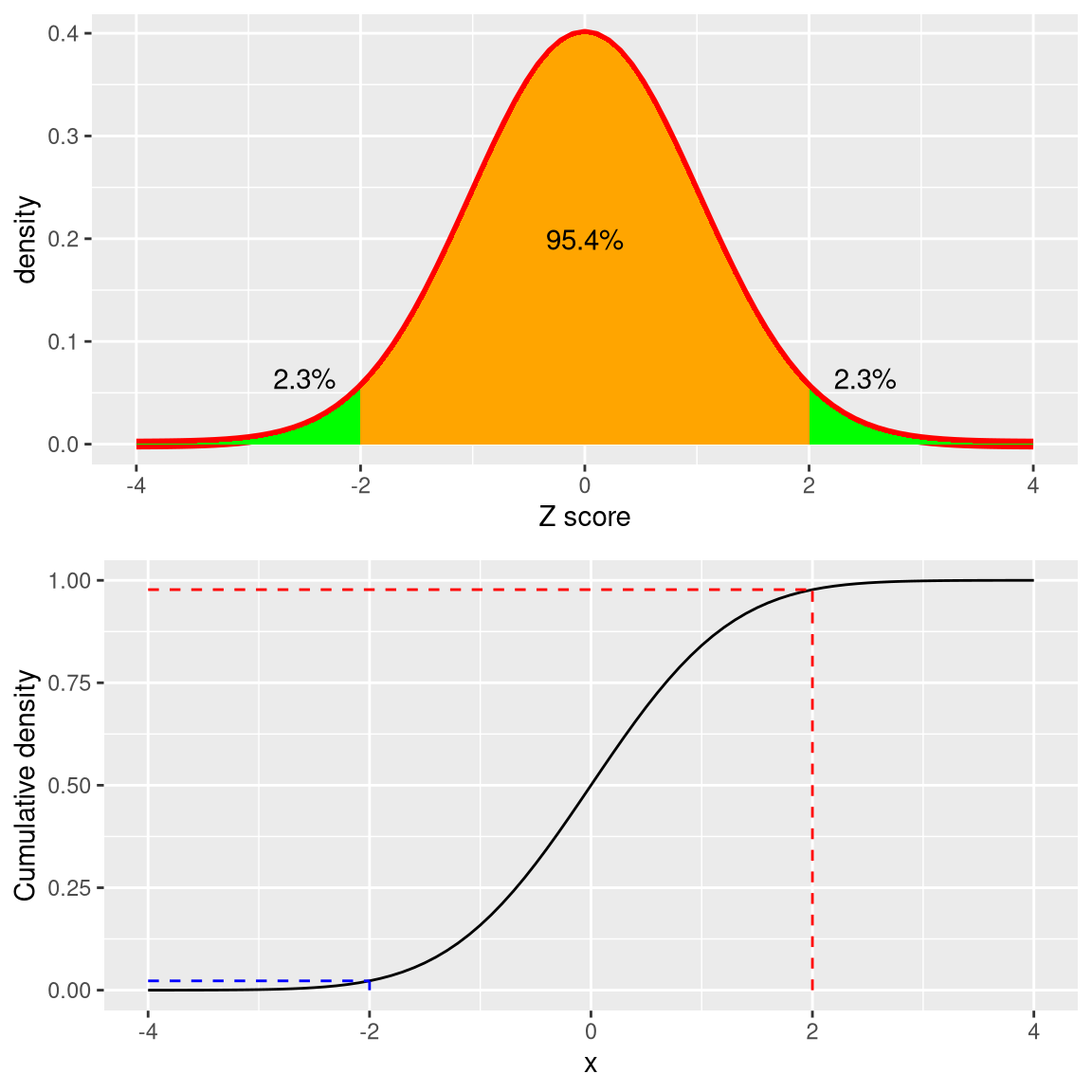
Figure 5.13: Density (top) and cumulative distribution (bottom) of a standard normal distribution, with cutoffs at two standard deviations above/below the mean
Figure 5.13 shows the same plot for two standard deviations. Here we see that only about 2.3% of values fall in \(Z \le -2\) and the same in \(Z \ge 2\). Thus, if we know the Z-score for a particular data point, we can estimate how likely or unlikely we would be to find a value at least as extreme as that value, which lets us put values into better context. In the case of crime rates, we see that California has a Z-score of 0.38 for its violent crime rate per capita, showing that it is quite near the mean of other states, with about 35% of states having higher rates and 65% of states having lower rates.
5.9.2 Standardized scores
Let’s say that instead of Z-scores, we wanted to generate standardized crime scores with a mean of 100 and standard deviation of 10. This is similar to the standardization that is done with scores from intelligence tests to generate the intelligence quotient (IQ). We can do this by simply multiplying the Z-scores by 10 and then adding 100.
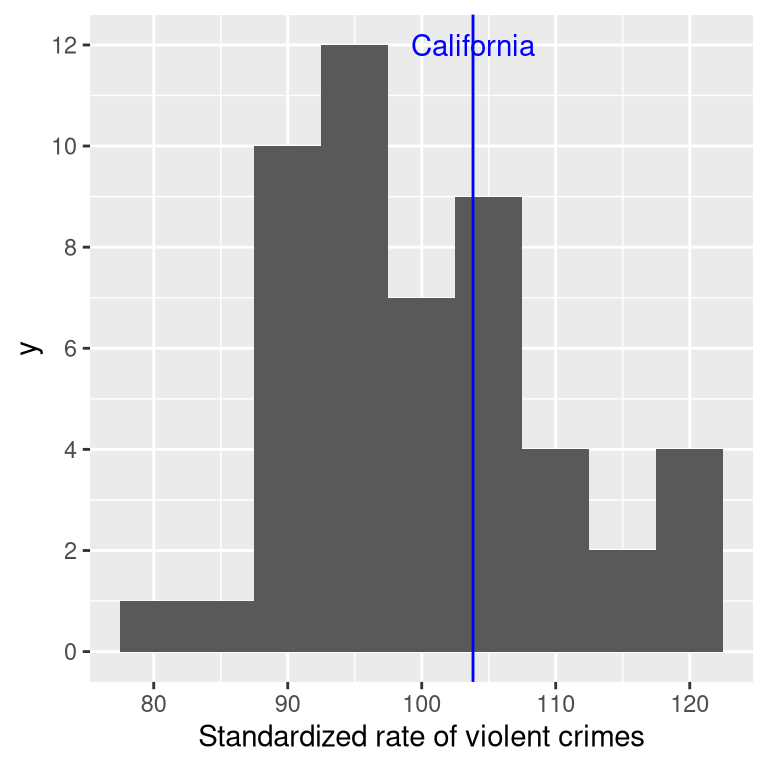
Figure 5.14: Crime data presented as standardized scores with mean of 100 and standard deviation of 10.
5.9.2.1 Using Z-scores to compare distributions
One useful application of Z-scores is to compare distributions of different variables. Let’s say that we want to compare the distributions of violent crimes and property crimes across states. In the left panel of Figure 5.15 we plot those against one another, with CA plotted in blue. As you can see, the raw rates of property crimes are far higher than the raw rates of violent crimes, so we can’t just compare the numbers directly. However, we can plot the Z-scores for these data against one another (right panel of Figure 5.15)– here again we see that the distribution of the data does not change. Having put the data into Z-scores for each variable makes them comparable, and lets us see that California is actually right in the middle of the distribution in terms of both violent crime and property crime.
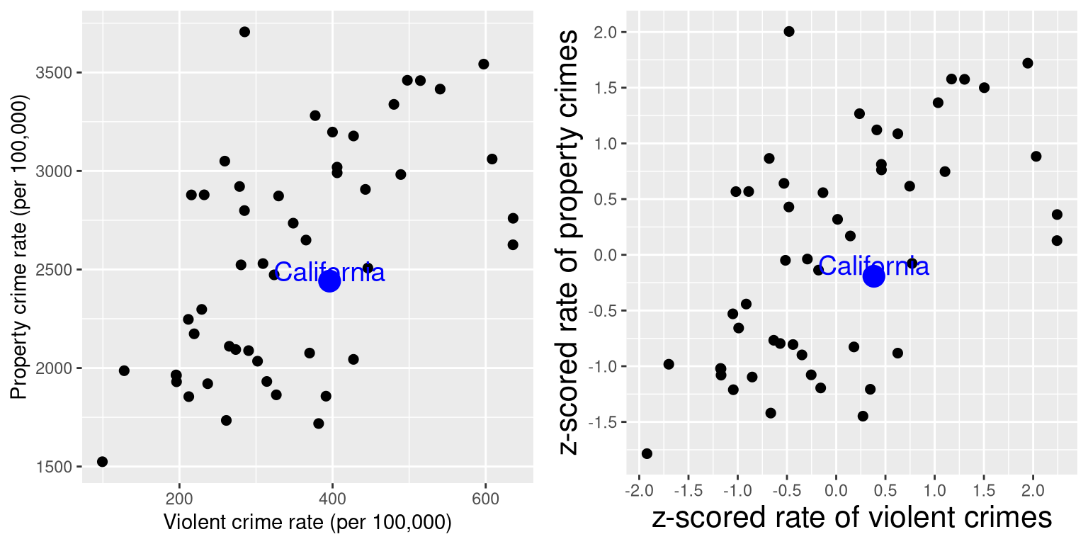
Figure 5.15: Plot of violent vs. property crime rates (left) and Z-scored rates (right).
Let’s add one more factor to the plot: Population. In the left panel of Figure 5.16 we show this using the size of the plotting symbol, which is often a useful way to add information to a plot.
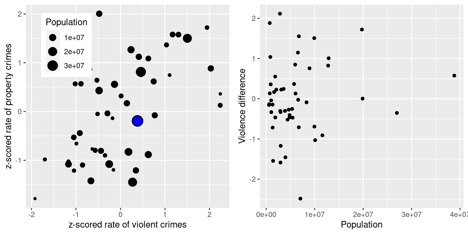
Figure 5.16: Left: Plot of violent vs. property crime rates, with population size presented through the size of the plotting symbol; California is presented in blue. Right: Difference scores for violent vs. property crime, plotted against population.
Because Z-scores are directly comparable, we can also compute a difference score that expresses the relative rate of violent to non-violent (property) crimes across states. We can then plot those scores against population (see right panel of Figure 5.16). This shows how we can use Z-scores to bring different variables together on a common scale.
It is worth noting that the smallest states appear to have the largest differences in both directions. While it might be tempting to look at each state and try to determine why it has a high or low difference score, this probably reflects the fact that the estimates obtained from smaller samples are necessarily going to be more variable, as we will discuss in Chapter 7.