Chapter 16 Multivariate statistics
The term multivariate refers to analyses that involve more than one random variable. Whereas we have seen previous examples where the model included multiple variables (as in linear regression), in those cases we were specifically interested in how the variation in a dependent variable could be explained in terms of one or more independent variables that are usually specified by the experimenter rather than measured. In a multivariate analysis we generally treat all of the variables as equals, and seek to understand how they relate to one another as a group.
There are many different kinds of multivariate analysis, but we will focus on two major approaches in this chapter. First, we may simply want to understand and visualize the structure that exists in the data, by which we usually mean which variables or observations are related to which other. We would usually define “related” in terms of some measure that indexes the distance between the values across variables. One important method that fits under this category is known as clustering, which aims to find clusters of variables or observations that are similar across variables.
Second, we may want to take a large number of variables and reduce them to a smaller number of variables in a way that retains as much information as possible. This is referred to as dimensionality reduction, where “dimensionality” refers to the number of variables in the dataset. We will discuss two techniques commonly used for dimensionality reduction, known as principal component analysis and factor analysis.
Clustering and dimensionality reduction are often classified as forms of unsupervised learning; this is in contrast to supervised learning which characterizes models such as linear regression that you’ve learned about so far. The reason that we consider linear regression to be “supervised” is that we know the value of thing that we are trying to predict (i.e. the dependent variable) and we are trying to find the model that best predicts those values. In unspervised learning, we don’t have a specific value that we are trying to predict; instead, we are trying to discover structure in the data that might be useful for understanding what’s going on, which generally requires some assumptions about what kind of structure we want to find.
One thing that you will discover in this chapter is that whereas there is generally a “right” answer in supervised learning (once we have agreed upon how to determine the “best” model, such as the sum of squared errors), there is often not an agreed-upon “right” answer in unsupervised learning. Different unsupervised learning methods can give very different answers about the same data, and there is usually no way in principle to determine which of these is “correct”, as it depends on the goals of the analysis and the assumptions that one is willing to make about the mechanisms that give rise to the data. Some people find this frustrating, while others find it exhilarating; it will be up to you to figure out which of these camps you fall into.
16.1 Multivariate data: An example
As an example of multivariate analysis, we will look at a dataset collected by my group and published by Eisenberg et al. (Eisenberg:2019um?). This dataset is useful both because it has a large number of interesting variables collected on a relatively large number of individuals, and because it is freely available online, so that you can explore it on your own.
This study was performed because we were interested in understanding how several different aspects of psychological function are related to one another, focusing particularly on psychological measures of self-control and related concepts. Participants performed a ten-hour long battery of cognitive tests and surveys over the course of a week; in this first example we will focus on variables related to two specific aspects of self-control. Response inhibition is defined as the ability to quickly stop an action, and in this study was measured using a set of tasks known as stop-signal tasks. The variable of interest for these tasks is an estimate of how long it takes a person to stop themself, known as the stop-signal reaction time (SSRT), of which there are four different measures in the dataset. Impulsivity is defined as the tendency to make decisions on impulse, without regard to potential consequences and longer-term goals. The study included a number of different surveys measuring impulsivity, but we will focus on the UPPS-P survey, which assesses five different facets of impulsivity.
After these scores have been computed for each of the 522 participants in Eisenberg’s study, we end up with 9 numbers for each individual. While multivariate data can sometimes have thousands or even millions of variables, it’s useful to see how the methods work with a small number of variables first.
16.2 Visualizing multivariate data
A fundamental challenge of multivariate data is that the human eye and brain are simply not equipped to visualize data with more than three dimensions. There are various tools that we can use to try to visualize multivariate data, but all of them break down as the number of variables grows. Once the number of variables becomes too large to directly visualize, one approach is to first reduce the number of dimensions (as discussed further below), and then visualize that reduced dataset.
16.2.1 Scatterplot of matrices
One useful way to visualize a small number of variables is to plot each pair of variables against one another, sometimes known as a “scatterplot of matrices”; An example is shown in Figure 16.1. Each row/column in the panel refers to a single variable – in this case one of our psychological variables from the earlier example. The diagonal elements on the plot show the distribution of each variable as a histogram. The elements below the diagonal show a scatterplot for each pair of matrices, overlaid with a regression line describing the relationship between the variables. The elements above the diagonal show the correlation coefficient for each pair of variables. When the number of variables is relatively small (about 10 or less) this can be a useful way to get good insight into a multivariate dataset.
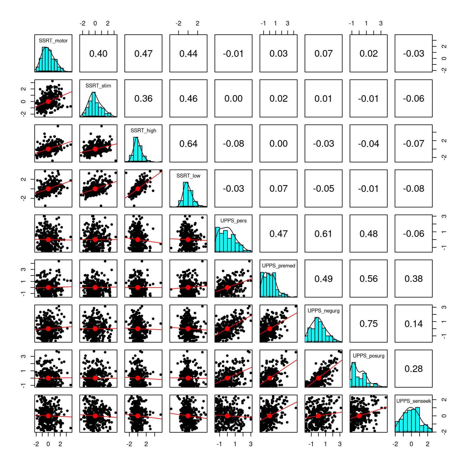
Figure 16.1: Scatterplot of matrices for the nine variables in the self-control dataset. The diagonal elements in the matrix show the histogram for each of the individual variables. The lower left panels show scatterplots of the relationship between each pair of variables, and the upper right panel shows the correlation coefficient for each pair of variables.
16.2.2 Heatmap
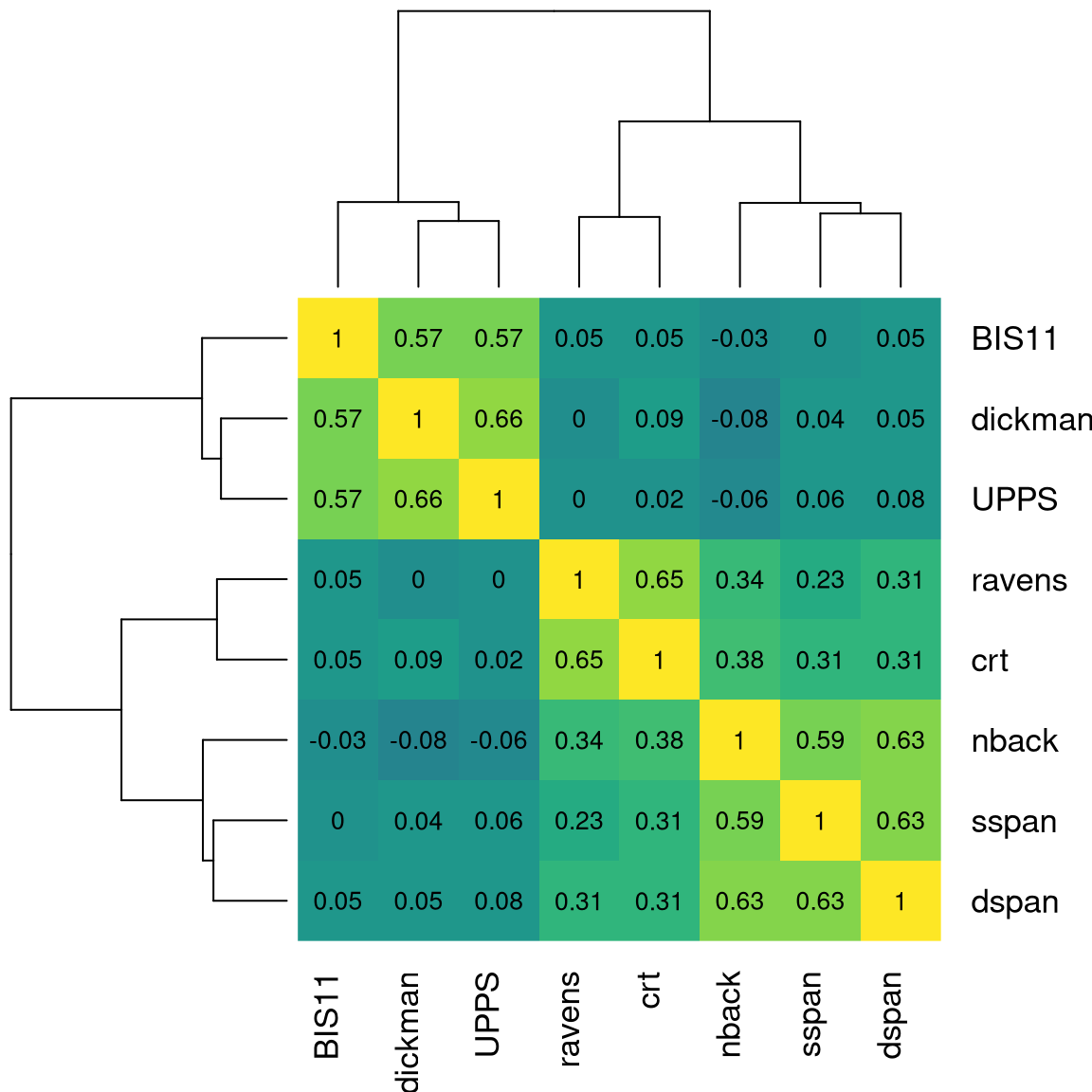
In some cases we wish to visualize the relationships between a large number of variables at once, usually focusing on the correlation coefficient. A useful way to do this can be to plot the correlation values as a heatmap, in which the color of the map relates to the value of the correlation. Figure 16.2 shows an example with a relatively small number of variables, using our psychological example from above. In this case, the heatmap helps the structure of the data “pop out” at us; we see that there are strong intercorrelations within the SSRT variables and within the UPPS variables, with relatively little correlation between the two sets of variables.
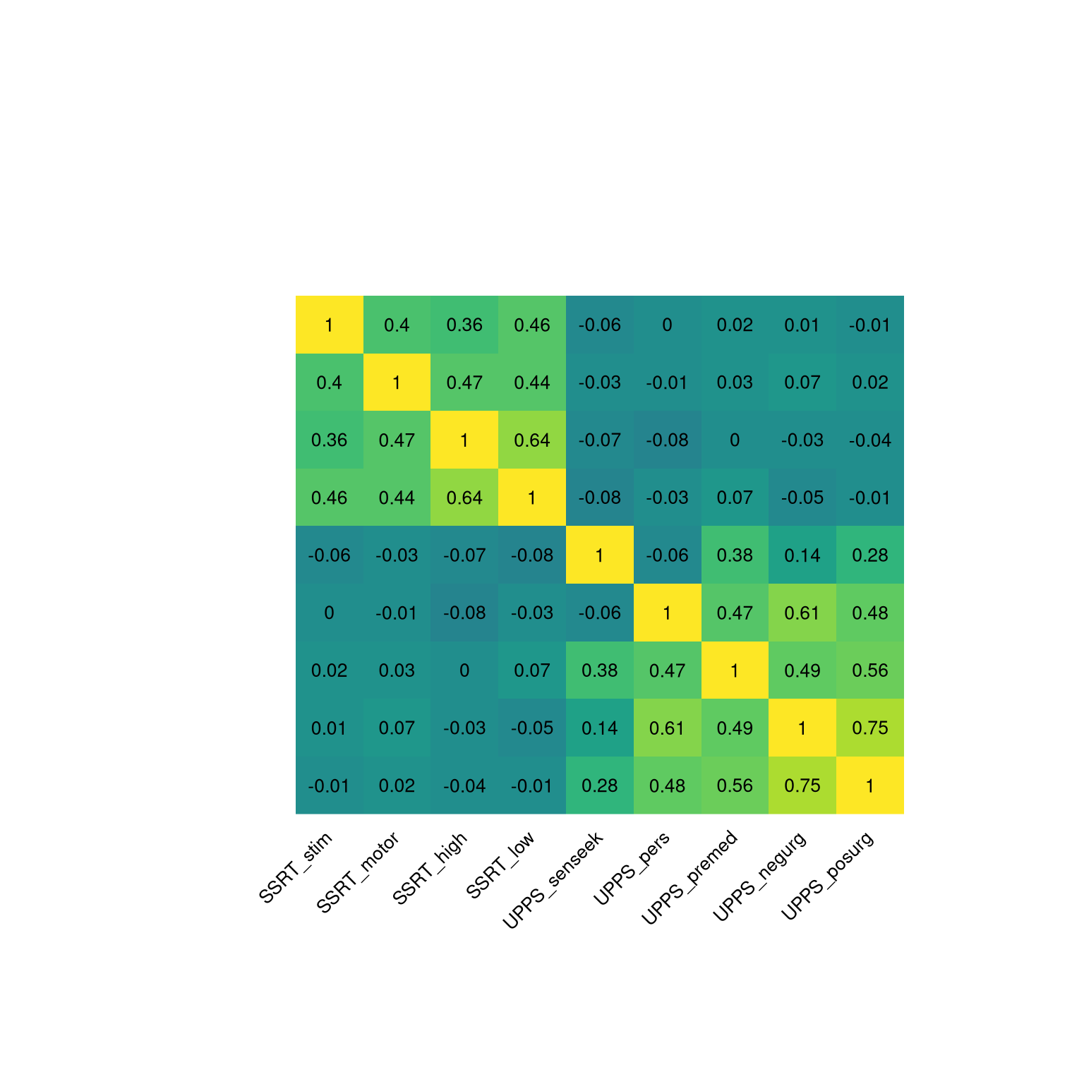
Figure 16.2: Heatmap of the correlation matrix for the nine self-control variables. The brighter yellow areas in the top left and bottom right highlight the higher correlations within the two subsets of variables.
Heatmaps become particularly useful for visualizing correlations between large numbers of variables. We can use brain imaging data as an example. It is common for neuroscience researchers to collect data about brain function from a large number of locations in the brain using functional magnetic resonance imaging (fMRI), and then to assess the correlation between those locations, to measure “function connectivity” between the regions. For example, Figure 16.3 shows a heatmap for a large correlation matrix, based on activity in over 300 regions in the brain of a single individual (yours truly). The presence of clear structure in the data pops out simply by looking at the heatmap. In particular we see that there are large sets of brain regions whose activity is highly correlated with each other (visible in the large yellow blocks along the diagonal of the correlation matrix), whereas these blocks are also strongly negatively correlated with other blocks (visible in the large blue blocks seen off the diagonal). Heatmaps are a powerful tool for easily visualizing large data matrices.
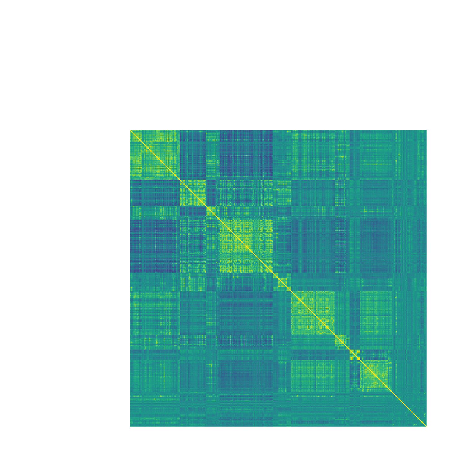
Figure 16.3: A heatmap showing the correlation coefficient of brain activity between 316 regions in the left hemisphere of a single individiual. Cells in yellow reflect strong positive correlation, whereas cells in blue reflect strong negative correlation. The large blocks of positive correlation along the diagonal of the matrix correspond to the major connected networks in the brain
16.3 Clustering
Clustering refers to a set of methods for identifying groups of related observations or variables within a dataset, based on the similarity of the values of the observations. Usually this similarity will be quantified in terms of some measure of the distance between multivariate values. The clustering method then finds the set of groups that have the lowest distance between their members.
One commonly used measure of distance for clustering is the Euclidean distance, which is basically the length of the line that connects two data points. Figure 16.4 shows an example of a dataset with two data points and two dimensions (X and Y). The Euclidean distance between these two points is the length of the dotted line that connects the points in space.
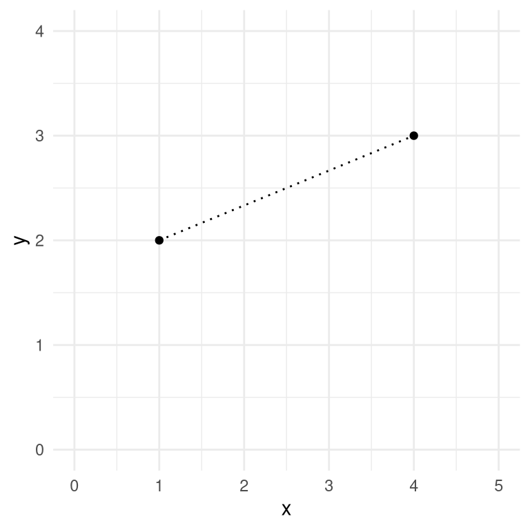
Figure 16.4: A depiction of the Euclidean distance between two points, (1,2) and (4,3). The two points differ by 3 along the X axis and by 1 along the Y axis.
The Euclidean distance is computed by squaring the differences in the locations of the points in each dimension, adding these squared differences, and then taking the square root. When there are two dimensions \(x\) and \(y\), this would be computed as:
\[ d(x, y) = \sqrt{(x_1 - x_2)^2 + (y_1 - y_2)^2} \]
Plugging in the values from our example data:
\[ d(x, y) = \sqrt{(1 - 4)^2 + (2 - 3)^2} = 3.16 \]
If the formula for Euclidean distance seems slightly familiar, this is because it is identical to the Pythagorean theorem that most of us learned in geometry class, which computes the length of the hypotenuse of a right triangle based on the lengths of the two sides. In this case, the length of the sides of the triangle correspond to the distance between the points along each of the two dimensions. While this example was in two dimensions, we will often work with data that have many more than two dimensions, but the same idea extends to arbitrary numbers of dimensions.
One important feature of the Euclidean distance is that it is sensitive to the overall mean and variability of the data. In this sense it is unlike the correlation coefficient, which measures the linear relationship between variables in a way that is insensitive to the overall mean or variability. For this reason, it is common to scale the data prior to computing the Euclidean distance, which is equivalent to converting each variable into its Z-scored version.
16.3.1 K-means clustering
One commonly used method for clustering data is K-means clustering. This technique identifies a set of cluster centers, and then assigns each data point to the cluster whose center is the closest (that is, has the lowest Euclidean distance) from the data point. As an example, let’s take the latitude and longitude of a number of countries around the world as our data points, and see whether K-means clustering can effectively identify the continents of the world.
Most statistical software packages have a built-in function for performing K-means clustering using a single command, but it’s useful to understand how it works step by step. We must first decide on a specific value for K, the number of clusters to be found in the data. It’s important to point out that there is no unique “correct” value for the number of clusters; there are various techniques that one can use to try to determine which solution is “best” but they can often give different answers, as they incorporate different assumptions or tradeoffs. Nonetheless, clustering techniques such as K-means are an important tool for understanding the structure of data, especially as they become high-dimensional.
Having selected the number of clusters (K) that we wish to find, we must come up with K locations that will be our starting guesses for the centers of our clusters (since we don’t initially know where the centers are). One simple way to start is to choose K of the actual data points at random and use those as our starting points, which are referred to as centroids. We then compute the Euclidean distance of each data point to each of the centroids, and assign each point to a cluster based on its closest centroid. Using these new cluster assignments, we recompute the centroid of each cluster by averaging the location of all of the points assigned to that cluster. This process is then repeated until a stable solution is found; we refer to this as an iterative processes, because it iterates until the answer doesn’t change, or until some other kind of limit is reached, such as a maximum number of possible iterations.
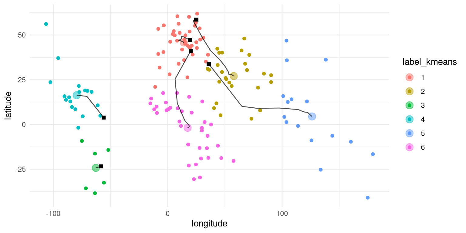
Figure 16.5: A two-dimensional depiction of clustering on the latitude and longitude of countries across the world. The square black symbols show the starting centroids for each cluster, and the lines show the movement of the centroid for that cluster across the iterations of the algorithm.
Applying K-means clustering to the latitude/longitude data (Figure 16.5), we see that there is a reasonable match between the resulting clusters and the continents, though none of the continents is perfectly matched to any of the clusters. We can further examine this by plotting a table that compares the membership of each cluster to the actual continents for each country; this kind of table is often called a confusion matrix.
##
## labels AF AS EU NA OC SA
##      1  5  1 36  0  0  0
##      2  3 24  0  0  0  0
##      3  0  0  0  0  0  7
##      4  0  0  0 15  0  4
##      5  0 10  0  0  6  0
## 6 35 0 0 0 0 0- Cluster 1 contains all European countries, as well as countries from northern Africa and Asia.
- Cluster 2 contains contains Asian countries as well as several African countries.
- Cluster 3 contains countries from the southern part of South America.
- Cluster 4 contains all of the North American countries as well as northern South American countries.
- Cluster 5 contains Oceania as well as several Asian countries
- Cluster 6 contains all of the remaining African countries.
Although in this example we know the actual clusters (that is, the continents of the world), in general we don’t actually know the ground truth for unsupervised learning problems, so we simply have to trust that the clustering method has found useful structure in the data. However, one important point about K-means clustering, and iterative procedures in general, is that they are not guaranteed to give the same answer each time they are run. The use of random numbers to determine the starting points means that the starting points can differ each time, and depending on the data this can sometimes lead to different solutions being found. For this example, K-means clustering will sometimes find a single cluster encompassing both North and South America, and sometimes find two clusters (as it did for the specific choice of random seed used here). Whenever using a method that involves an iterative solution, it is important to rerun the method a number of times using different random seeds, to make sure that the answers don’t diverge too greatly between runs. If they do, then one should avoid making strong conclusions based on the unstable results. In fact, it’s probably a good idea to avoid strong conclusions on the basis of clustering results more generally; they are primarily useful for getting intuition about the structure that might be present in a dataset.
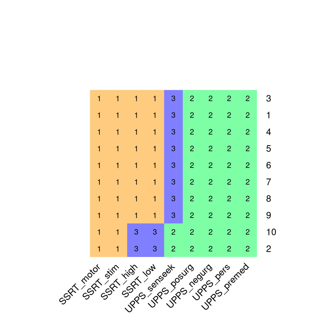
Figure 16.6: A visualization of the clustering results from 10 runs of the K-means clustering algorithm with K=3. Each row in the figure represents a different run of the clustering algorithm (with different random starting points), and variables sharing the same color are members of the same cluster.
We can apply K-means clustering to the self-control variables in order to determine which variables are most closely related to one another. For K=2, the K-means algorithm consistently picks out one cluster containing the SSRT variables and one containing the impulsivity variables. With higher values of K, the results are less consistent; for example, with K=3 the algorithm sometimes identifies a third cluster containing only the UPPS sensation seeking variable, whereas in other cases it splits the SSRT variables into two separate clusters (as seen in Figure 16.6). The stability of the clusters with K=2 suggests that this is probably the most robust clustering for these data, but these results also highlight the importance of running the algorithm multiple times to determine whether any particular clustering result is stable.
16.3.2 Hierarchical clustering
Another useful method for examining the structure of a multivariate dataset is known as hierarchical clustering. This technique also uses the distances between data points to determine clusters, but it also provides a way to visualize the relationships between data points in terms of a tree-like structure known as a dendrogram.
The most commonly used hierarchical clustering procedure is known as agglomerative clustering. This procedure starts by treating each data point as its own cluster, and then progressively creates new clusters by combining the two clusters with the least distance between them. It continues to do this until there is only a single cluster. This requires computing the distance between clusters, and there are numerous ways to do this; in this example we will use the average linkage method, which simply takes the average of all of the distances between each each data point in each of two clusters. As an example, we will examine the relationship between the self-control variables that were described above.
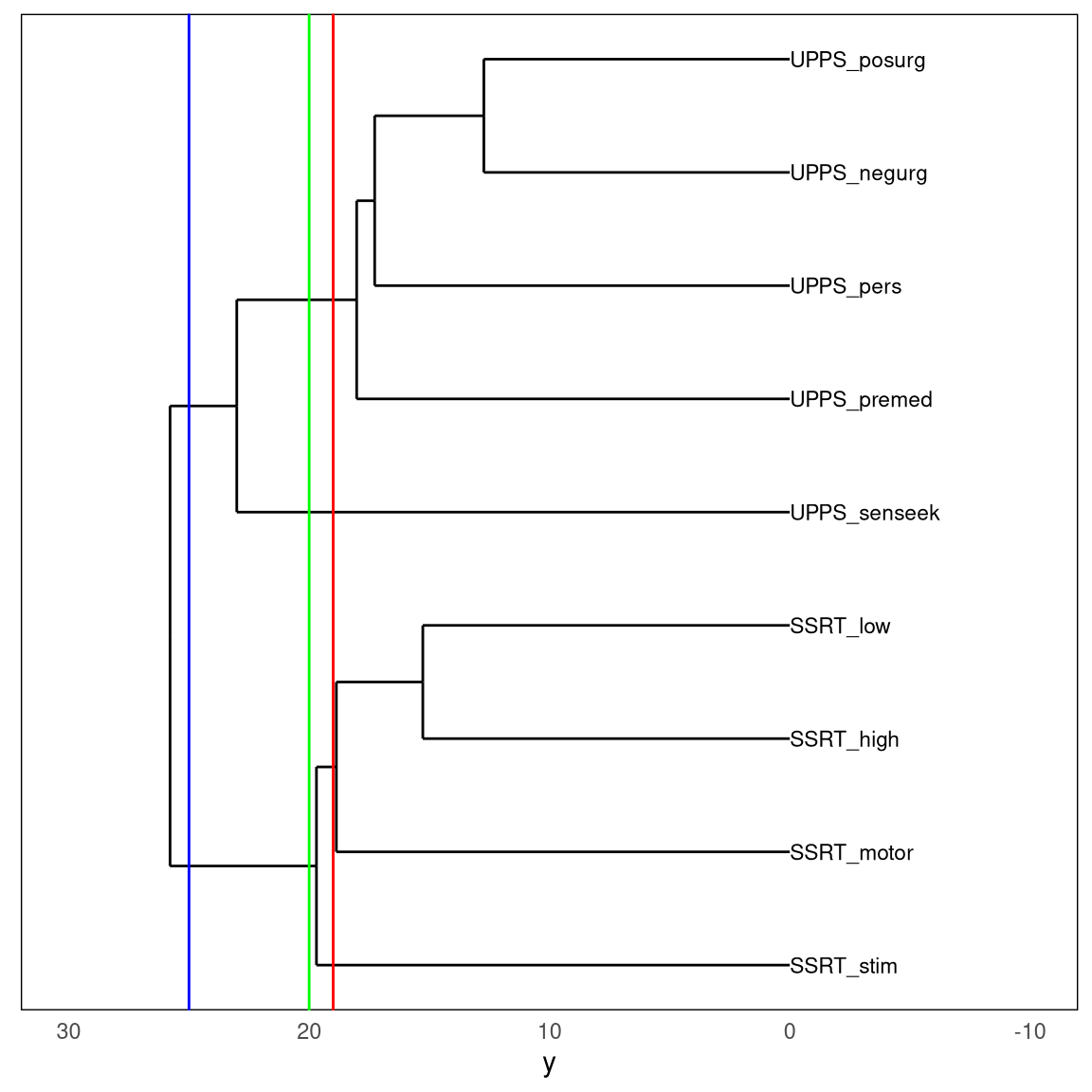
Figure 16.7: A dendrogram depicting the relative similarity of the nine self-control variables. The three colored vertical lines represent three different cutoffs, resulting in either two (blue line), three (green line), or four (red line) clusters.
Figure 16.7 shows the dendrogram generated from the self-regulation dataset. Here we see that there is structure in the relationships between variables that can be understood at various levels by “cutting” the tree to create different numbers of clusters: if we cut the tree at 25, we get two clusters; if we cut it at 20 we get three clusters, and at 19 we get four clusters.
Interestingly, the solution found by the hierarchical clustering analysis of the self-control data is identical to the solution found in the majority of the K-means clustering runs, which is comforting.
Our interpretation of this analysis would be that there is a high degree of similarity within each of the variable sets (SSRT and UPPS) compared to between the sets. Within the UPPS variables, it seems that the sensation seeking variable stands separately from the others, which are much more similar to one another. Within the SSRT variables, it seems that the stimulus selective SSRT variable is distinct from the other three, which are more similar. These are the kinds of conclusions that can be drawn from a clustering analysis. It is again important to point out that there is no single “right” number of clusters; different methods rely upon different assumptions or heuristics, and can give different results and interpretations. In general, it’s good to present the data clustered at several different levels, and make sure that this doesn’t drastically change the interpretation of the data.
16.4 Dimensionality reduction
It is often the case with multivariate data that many of the variables will be highly similar to one another, such that they are largely measuring the same thing. One way to think of this is that while the data have a particular number of variables, which we call its dimensionality, in reality there are not as many underlying sources of information as there are variables. The idea behind dimensionality reduction is to reduce the number of variables in order to create composite variables that reflect underlying signals in the data.
16.4.1 Principal component analysis
The idea behind principal component analysis is to find a lower-dimensional description of a set of variables that accounts for the maximum possible amount of information in the full dataset. A deep understanding of principal component analysis requires an understanding of linear algebra, which is beyond the scope of this book; see the resources at the end of this chapter for helpful guides to this topic. In this section I will outline the concept and hopefully whet your appetite to learn more.
We will start with a simple example with just two variables in order to give an intuition for how it works. First we generate some synthetic data for variables X and Y, with a correlation of 0.7 between the two variables. The goal of principal component analysis is to find a linear combination of the observed variables in the dataset that will explain the maximum amount of variance; the idea here is that the variance in the data is a combination of signal and noise, and we want to find the strongest common signal between the variables. The first principal component is the combination that explains the maximum variance. The second component is the the one that explains the maximum remaining variance, while also being uncorrelated with the first component. With more variables we can continue this process to obtain as many components as there are variables (assuming that there are more observations than there are variables), though in practice we usually hope to find a small number of components that can explain a large portion of the variance.
In the case of our two-dimensional example, we can compute the principal components and plot them over the data (Figure 16.8). What we see is that the first principal component (shown in green) follows the direction of the greatest variance. This line is similar, though not identical, to the linear regression line; while the linear regression solution minimizes the distance between each data point and the regression line at the same X value (i.e. the vertical distance), the principal component minimizes the Euclidean distance between the data points and the line representing the component (i.e. the distance perpendicular to the component). The second component points in a direction that is perpendicular to the first component (which is equivalent to being uncorrelated).
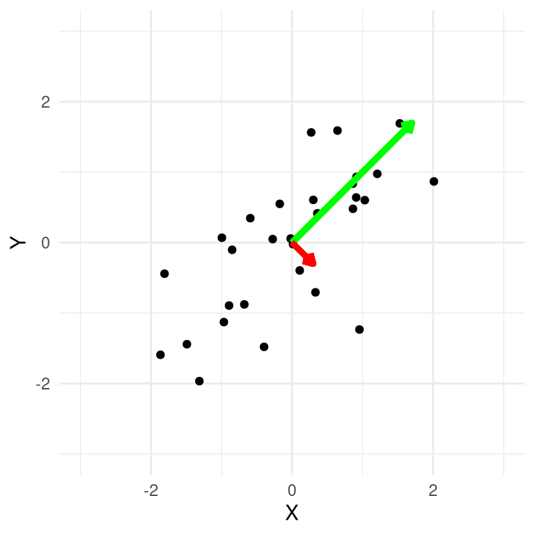
Figure 16.8: A plot of synthetic data, with the first principal component plotted in green and the second in red.
It’s common to use PCA to reduce the dimensionality of a more complex dataset. For example, let’s say that we would like to know whether performance on all four of the stop signal task variables in the earlier dataset are related to the five impulsivity survey variables. We can perform PCA on each of those datasets separately, and examine how much of the variance in the data is accounted for by the first principal component, which will serve as our summary of the data.
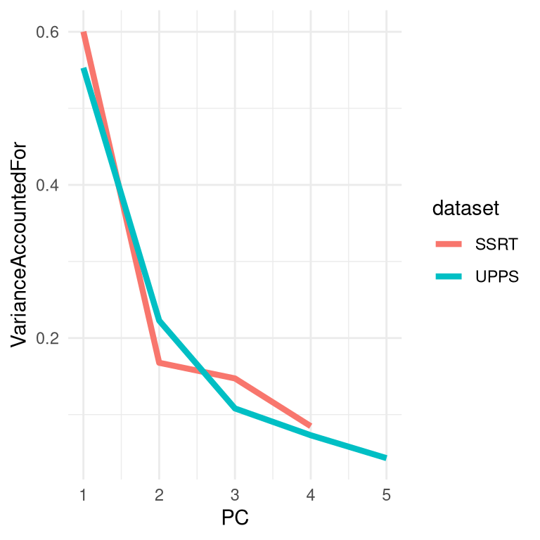
Figure 16.9: A plot of the variance accounted for (or scree plot) for PCA applied separately to the response inhibition and impulsivity variables from the Eisenberg dataset.
We see in Figure 16.9 that for the stop signal variables, the first principal component accounts for about 60% of the variance in the data, whereas for the UPPS it accounts for about 55% of the variance. We can then compute the correlation between the scores obtained using the first principal component from each set of variables, in order to ask whether the there is a relation between the two sets of variables. The correlation of -0.014 between the two summary variables suggests that there is no overall relationship between response inhibition and impulsivity in this dataset.
##
##  Pearson's product-moment correlation
##
## data:  pca_df$SSRT and pca_df$UPPS
## t = -0.3, df = 327, p-value = 0.8
## alternative hypothesis: true correlation is not equal to 0
## 95 percent confidence interval:
##  -0.123  0.093
## sample estimates:
##    cor
## -0.015
We could also perform PCA on all of these variables at once. Looking at the plot of variance accounted for (also known as a *scree plot) in Figure 16.7, we can see that the first two components account for a substantial amount of the variance in the data. We can then look at the loadings of each of the individual variables on these two components to understand how each specific variable is associated with the different components.
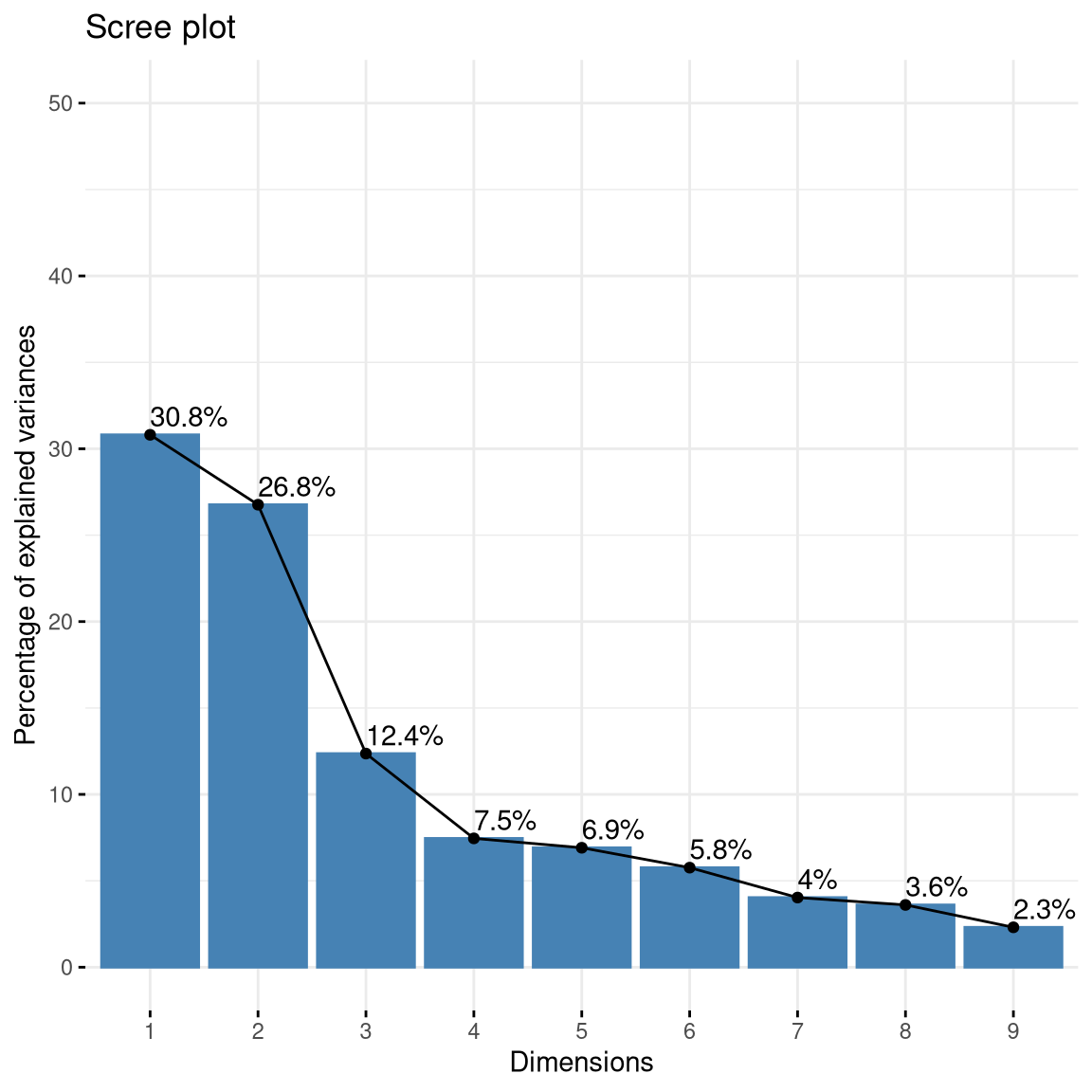
(#fig:imp_pc_scree)Plot of variance accounted for by PCA components computed on the full set of self-control variables.
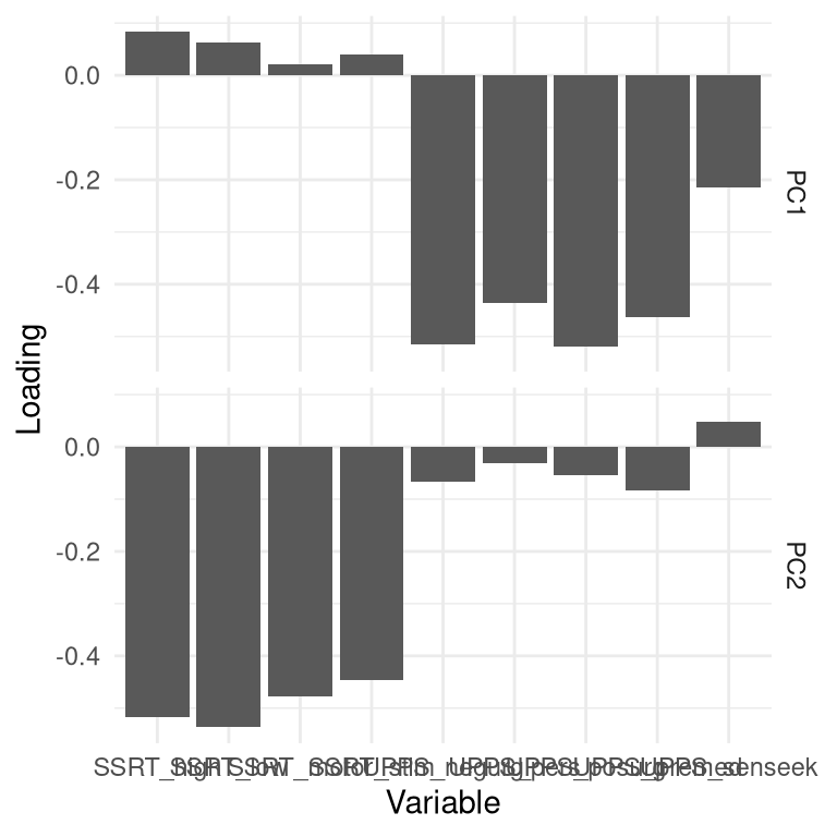
Figure 16.10: Plot of variable loadings in PCA solution including all self-control variables. Each variable is shown in terms of its loadings on each of the two components; reflected in the two rows respectively.
Doing this for the impulsivity dataset (Figure 16.10), we see that the first component (in the first row of the figure) has nonzero loadings for most of the UPPS variables, and nearly zero loadings for each of the SSRT variables, whereas the opposite is true of the second principal component, which loads primarily on the SSRT variables. This tells us that the first principal component captured mostly variance related to the impulsivity measures, while the second component captured mostly variance related to the response inhibition measures. You might notice that the loadings are actually negative for most of these variables; the sign of the loadings is arbitrary, so we should make sure to look at large positive and negative loadings.
16.4.2 Factor analysis
While principal component analysis can be useful for reducing a dataset to a smaller number of composite variables, the standard methods for PCA have some limitations. Most importantly, it ensures that the components are uncorrelated; while this may sometimes be useful, there are often cases where we want to extract dimensions that may be correlated with one another. A second limitation is that PCA doesn’t account for measurement error in the variables that are being analyzed, which can lead to difficult in interpreting the resulting loadings on the components. Although there are modifications of PCA that can address these issues, it is more common in some fields (such as psychology) to use a technique called exploratory factor analysis (or EFA) to reduce the dimensionality of a dataset.1
The idea behind EFA is that each observed variable is created through a combination of contributions from a set of latent variables – that is, variables that cannot be observed directly – along with some amount of measurement error for each variable. For this reason, EFA models are often referred to as belonging to a class of statistical models known as latent variable models.
For example, let’s say that we want to understand how measures of several different variables relate to the underlying factors that give rise to those measurements. We will first generate a synthetic dataset to show how this might work. We will generate a set of individuals for whom we will pretend that we know the values of several latent psychological variables: impulsivity, working memory capacity, and fluid reasoning We will assume that working memory capacity and fluid reasoning are correlated with one another, but that neither is correlated with impulsivity. From these latent variables we will then generate a set of eight observed variables for each indivdiual, which are simply linear combinations of the latent variables along with random noise added to simulate measurement error.
We can further examine the data by displaying a heatmap of the correlation matrix relating all of these variables (Figure 16.7. We see from this that there are three clusters of variables corresponding to our three latent variables, which is as it should be.
(#fig:efa_cor_hmap)A heatmap showing the correlations between the variables generated from the three underlying latent variables.
We can think of EFA as estimating the parameters of a set of linear models all at once, where each model relates each of the observed variables to the latent variables. For our example, these equations would look as follows. In these equations, the \(\beta\) characters have two subscripts, one that refers to the task and the other than refers to the latent variable, and a variable \(\epsilon\) that refers to the error. Here we will assume that everything has a mean of zero, so that we don’t need to include an extra intercept term for each equation.
\[ \begin{array}{lcl} nback & = &beta_{[1, 1]} * WM + \beta_{[1, 2]} * FR + \beta_{[1, 3]} * IMP + \epsilon \\ dspan & = &beta_{[2, 1]} * WM + \beta_{[2, 2]} * FR + \beta_{[2, 3]} * IMP + \epsilon \\ ospan & = &beta_{[3, 1]} * WM + \beta_{[3, 2]} * FR + \beta_{[3, 3]} * IMP + \epsilon \\ ravens & = &beta_{[4, 1]} * WM + \beta_{[4, 2]} * FR + \beta_{[4, 3]} * IMP + \epsilon \\ crt & = &beta_{[5, 1]} * WM + \beta_{[5, 2]} * FR + \beta_{[5, 3]} * IMP + \epsilon \\ UPPS & = &beta_{[6, 1]} * WM + \beta_{[6, 2]} * FR + \beta_{[6, 3]} * IMP + \epsilon \\ BIS11 & = &beta_{[7, 1]} * WM + \beta_{[7, 2]} * FR + \beta_{[7, 3]} * IMP + \epsilon \\ dickman & = &beta_{[8, 1]} * WM + \beta_{[8, 2]} * FR + \beta_{[8, 3]} * IMP + \epsilon \\ \end{array} \]
In effect what we want to do using EFA is to estimate the matrix of coefficients (betas) that map the latent variables into the observed variables. For the data that we are generating, we know that most of the betas in this matrix are zero because we created them that way; for each task, only one of the weights is set to 1, which means that each task is a noisy measurement of a single latent variable.
We can apply EFA to our synthetic dataset to estimate these parameters. We won’t go into the details of how EFA is actually performed, other than to mention one important point. Most of the previous analyses in this book have relied upon methods that try to minimize the difference between the observed data values and the values predicted by the model. The methods that are used to estimate the parameters for EFA instead attempt to minimize the difference between the observed covariances between the observed variables, and the covariances implied by the model parameters. For this reason, these methods are often referred to as covariance structure models.
Let’s apply an exploratory factor analysis to our synthetic data. As with clustering methods, we need to first determine how many latent factors we want to include in our model. In this case we know there are three factors, so let’s start with that; later on we will examine ways to estimate the number of factors directly from the data. Here is the output from our statistical software for this model:
##
## Factor analysis with Call: fa(r = observed_df, nfactors = 3)
##
## Test of the hypothesis that 3 factors are sufficient.
## The degrees of freedom for the model is 7  and the objective function was  0.04
## The number of observations was  200  with Chi Square =  8  with prob <  0.34
##
## The root mean square of the residuals (RMSA) is  0.01
## The df corrected root mean square of the residuals is  0.03
##
## Tucker Lewis Index of factoring reliability =  0.99
## RMSEA index =  0.026  and the 10 % confidence intervals are  0 0.094
## BIC =  -29
One question that we would like to ask is how well our model actually fits the data. There is no single way to answer this question; rather, researchers have developed a number of different methods that provide some insight into how well the model fits the data. For example, one commonly used criterion is based on the root mean square error of approximation (RMSEA) statistic, which quantifies how far the predicted covariances are from the actual covariances; a value of RMSEA less than 0.08 is often considered to reflect an adequately fitting model. In the example here, the RMSEA value is 0.026, which suggests a model that fits quite well.
We can also examine the parameter estimates in order to see whether the model has appropriately identified the structure in the data. It’s common to plot this as a graph, with arrows from the latent variables (represented as ellipses) pointing to the observed variables (represented as rectangles), where an arrow represents a substantial loading of the observed variable on the latent variable; this kind of graph is often referred to as a path diagram since it reflects the paths relating the variables. This is shown in Figure 16.11. In this case the EFA procedure correctly identified the structure present in the data, both in terms of which observed variables are related to each of the latent variables, and in terms of the correlations between latent variables.
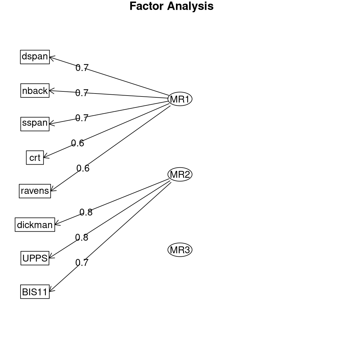
Figure 16.11: Path diagram for the exploratory factor analysis model.
16.4.3 Determining the number of factors
One of the main challenges in applying EFA is to determine the number of factors. A common way to do this is to examine the fit of the model while varying the number of factors, and then selecting the model that gives the best fit. This is not foolproof, and there are multiple ways to quantify the fit of the model that can sometimes give different answers.
One might think that we could simply look at how well the model fits and pick the number of factors with the best fit, but this won’t work, because a more complex model will always fit the data better (as we saw in our earlier discussion of overfitting). For this reason, we need to use a metric of model fit that penalizes for the number of parameters in the model. For the purposes of this example we will select one of the common methods for quantifying model fit, which is known as the sample-size adjusted Bayesian information criterion (or SABIC). This measure quantifies how well the model fits the data, while also taking into account the number of parameters in the model (which in this case is related to the number of factors) as well as the sample size. While the absolute value of the SABIC is not interpretable, when using the same data and same kind of model we can compare models using SABIC to determine which is most appropriate for the data. One important thing to know about SABIC and other measures like it (known as information criteria) is that lower values represent better fit of the model, so in this case we want to find the number of factors with the lowest SABIC. In Figure 16.12 we see that the model with the lowest SABIC has three factors, which shows that this approach was able to accurately determine the number of factors used to generate the data.
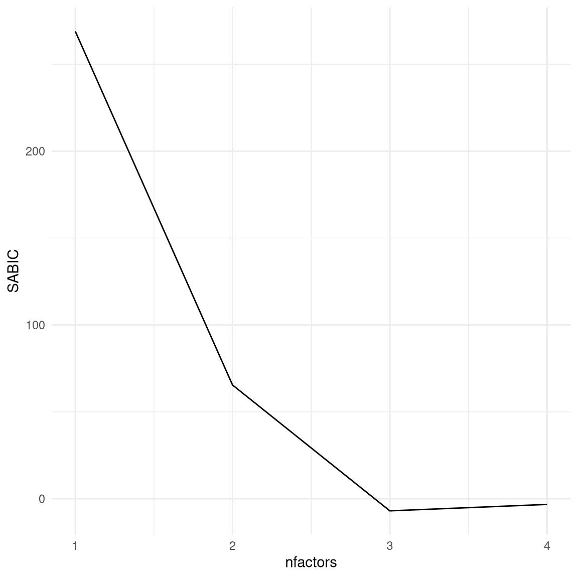
Figure 16.12: Plot of SABIC for varying numbers of factors.
Now let’s see what happens when we apply this model to real data from the Eisenberg et al. dataset, which contains measurements of all of the eight variables that were simulated in the above example. The model with three factors also has the lowest SABIC for these real data.
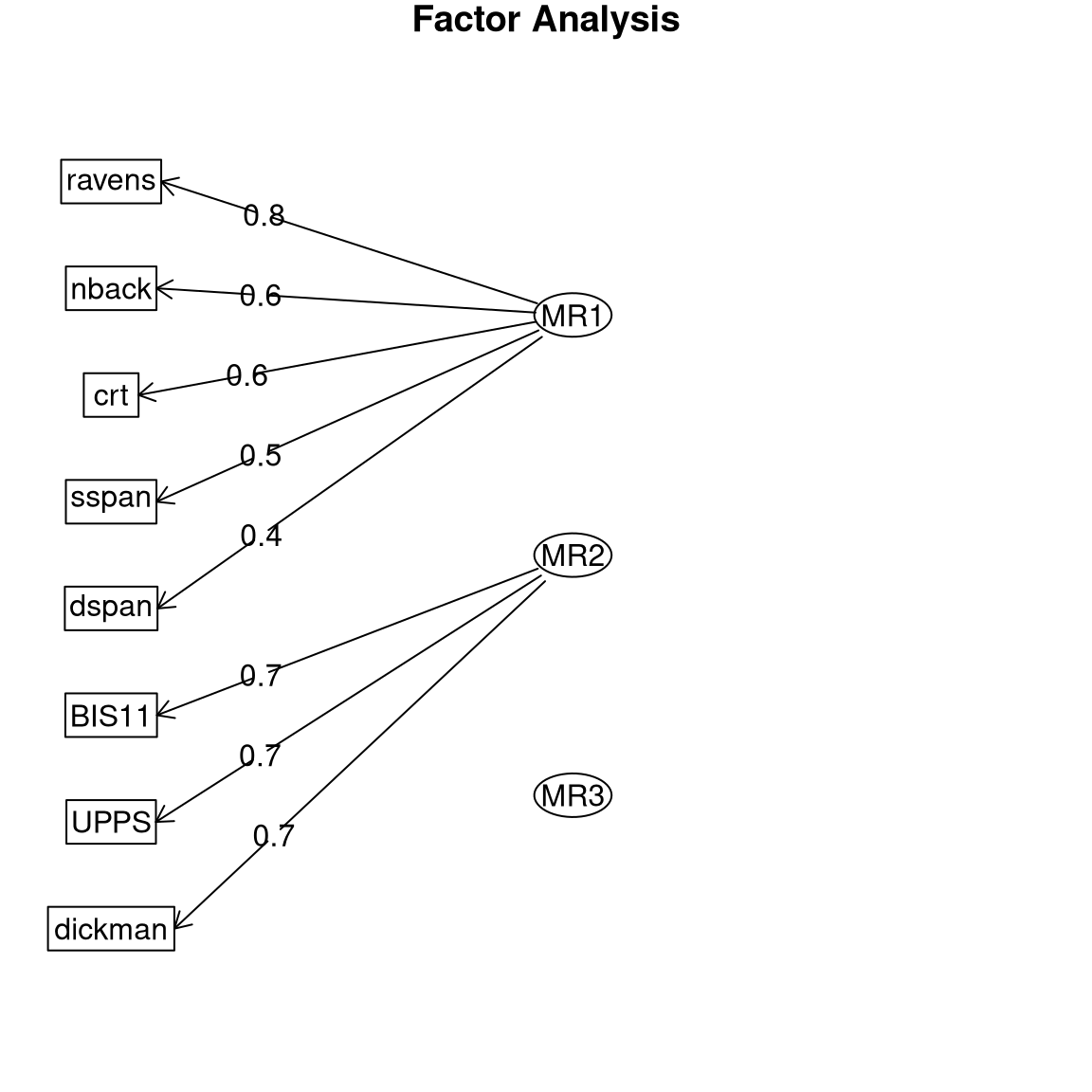
Figure 16.13: Path diagram for the three-factor model on the Eisenberg et al. data.
Plotting the path diagram (Figure 16.13) we see that the real data demonstrate a factor structure that is very similar to what we saw with the simulated data. This should not be surprising, since the simulated data were generated based on knowledge of these different tasks, but it’s comforting to know that human behavior is systematic enough that we can reliably identify these kinds of relationships. The main difference is that the correlation between the working memory factor (MR3) and the fluid reasoning factor (MR1) is even higher than it was in the simulated data. This result is scientifically useful because it shows us that while working memory and fluid reasoning are closely related, there is utility in separately modeling them.
16.5 Learning objectives
Having read this chapter, you should be able to:
- Describe the distinction between supervised and unsupervised learning.
- Employ visualization techniques including heatmaps to visualize the structure of multivariate data.
- Understand the concept of clustering and how it can be used to identify structure in data.
- Understand the concept of dimensionality reduction.
- Describe how principal component analysis and factor analysis can be used to perform dimensionality reduction.
There is another application of factor analysis known as confirmatory factor analysis (or CFA) that we will not discuss here; In practice its application can be problematic, and recent work has started to move towards modifications of EFA that can answer the questions often addressed using CFA.(Marsh:2014th?)↩︎