Chapter 3 Summarizing data
I mentioned in the Introduction that one of the big discoveries of statistics is the idea that we can better understand the world by throwing away information, and that’s exactly what we are doing when we summarize a dataset. In this Chapter we will discuss why and how to summarize data.
3.1 Why summarize data?
When we summarize data, we are necessarily throwing away information, and one might plausibly object to this. As an example, let’s go back to the PURE study that we discussed in Chapter 1. Are we not supposed to believe that all of the details about each individual matter, beyond those that are summarized in the dataset? What about the specific details of how the data were collected, such as the time of day or the mood of the participant? All of these details are lost when we summarize the data.
One reason that we summarize data is that it provides us with a way to generalize - that is, to make general statements that extend beyond specific observations. The importance of generalization was highlighted by the writer Jorge Luis Borges in his short story “Funes the Memorious”, which describes an individual who loses the ability to forget. Borges focuses in on the relation between generalization (i.e. throwing away data) and thinking: “To think is to forget a difference, to generalize, to abstract. In the overly replete world of Funes, there were nothing but details.”
Psychologists have long studied all of the ways in which generalization is central to thinking. One example is categorization: We are able to easily recognize different examples of the category of “birds” even though the individual examples may be very different in their surface features (such as an ostrich, a robin, and a chicken). Importantly, generalization lets us make predictions about these individuals – in the case of birds, we can predict that they can fly and eat seeds, and that they probably can’t drive a car or speak English. These predictions won’t always be right, but they are often good enough to be useful in the world.
3.2 Summarizing data using tables
A simple way to summarize data is to generate a table representing counts of various types of observations. This type of table has been used for thousands of years (see Figure 3.1).

Figure 3.1: A Sumerian tablet from the Louvre, showing a sales contract for a house and field. Public domain, via Wikimedia Commons.
Let’s look at some examples of the use of tables, using a more realistic dataset. Throughout this book we will use the National Health and Nutrition Examination Survey (NHANES) dataset. This is an ongoing study that assesses the health and nutrition status of a sample of individuals from the United States on many different variables. We will use a version of the dataset that is available for the R statistical software package. For this example, we will look at a simple variable, called PhysActive in the dataset. This variable contains one of three different values: “Yes” or “No” (indicating whether or not the person reports doing “moderate or vigorous-intensity sports, fitness or recreational activities”), or “NA” if the data are missing for that individual. There are different reasons that the data might be missing; for example, this question was not asked of children younger than 12 years of age, while in other cases an adult may have declined to answer the question during the interview, or the interviewer’s recording of the answer on their form might be unreadable.
3.2.1 Frequency distributions
A distribution describes how data are divided between different possible values. For this example, let’s look at how many people fall into each of the physical activity categories.
| PhysActive | AbsoluteFrequency |
|---|---|
| No | 2473 |
| Yes | 2972 |
| NA | 1334 |
Table 3.1 shows the frequencies of each of the different values; there were 2473 individuals who responded “No” to the question, 2972 who responded “Yes”, and 1334 for whom no response was given. We call this a frequency distribution because it tells us how frequent each of the possible values is within our sample.
This shows us the absolute frequency of the two responses, for everyone who actually gave a response. We can see from this that there are more people saying “Yes” than “No”, but it can be hard to tell from absolute numbers how big the difference is in relative terms. For this reason, we often would rather present the data using relative frequency, which is obtained by dividing each frequency by the sum of all frequencies:
\[ relative\ frequency_i = \frac{absolute\ frequency_i}{\sum_{j=1}^N absolute\ frequency_j} \] The relative frequency provides a much easier way to see how big the imbalance is. We can also interpret the relative frequencies as percentages by multiplying them by 100. In this example, we will drop the NA values as well, since we would like to be able to interpret the relative frequencies of active versus inactive people. However, for this to make sense we have to assume that the NA values are missing “at random”, meaning that their presence or absence is not related to the true value of the variable for that person. For example, if inactive participants were more likely to refuse to answer the question than active participants, then that would bias our estimate of the frequency of physical activity, meaning that our estimate would be different from the true value.
| PhysActive | AbsoluteFrequency | RelativeFrequency | Percentage |
|---|---|---|---|
| No | 2473 | 0.45 | 45 |
| Yes | 2972 | 0.55 | 55 |
Table 3.2 lets us see that 45.4 percent of the individuals in the NHANES sample said “No” and 54.6 percent said “Yes”.
3.2.2 Cumulative distributions
The PhysActive variable that we examined above only had two possible values, but often we wish to summarize data that can have many more possible values. When those values are quantitative, then one useful way to summarize them is via what we call a cumulative frequency representation: rather than asking how many observations take on a specific value, we ask how many have a value some specific value or less.
Let’s look at another variable in the NHANES dataset, called SleepHrsNight which records how many hours the participant reports sleeping on usual weekdays. Table 3.3 shows a frequency table created as we did above, after removing anyone with missing data for this question. We can already begin to summarize the dataset just by looking at the table; for example, we can see that most people report sleeping between 6 and 8 hours. To see this even more clearly, we can plot a histogram which shows the number of cases having each of the different values; see left panel of Figure 3.2. We can also plot the relative frequencies, which we will often refer to as densities - see the right panel of Figure 3.2.
| SleepHrsNight | AbsoluteFrequency | RelativeFrequency | Percentage |
|---|---|---|---|
| 2 | 9 | 0.00 | 0.18 |
| 3 | 49 | 0.01 | 0.97 |
| 4 | 200 | 0.04 | 3.97 |
| 5 | 406 | 0.08 | 8.06 |
| 6 | 1172 | 0.23 | 23.28 |
| 7 | 1394 | 0.28 | 27.69 |
| 8 | 1405 | 0.28 | 27.90 |
| 9 | 271 | 0.05 | 5.38 |
| 10 | 97 | 0.02 | 1.93 |
| 11 | 15 | 0.00 | 0.30 |
| 12 | 17 | 0.00 | 0.34 |
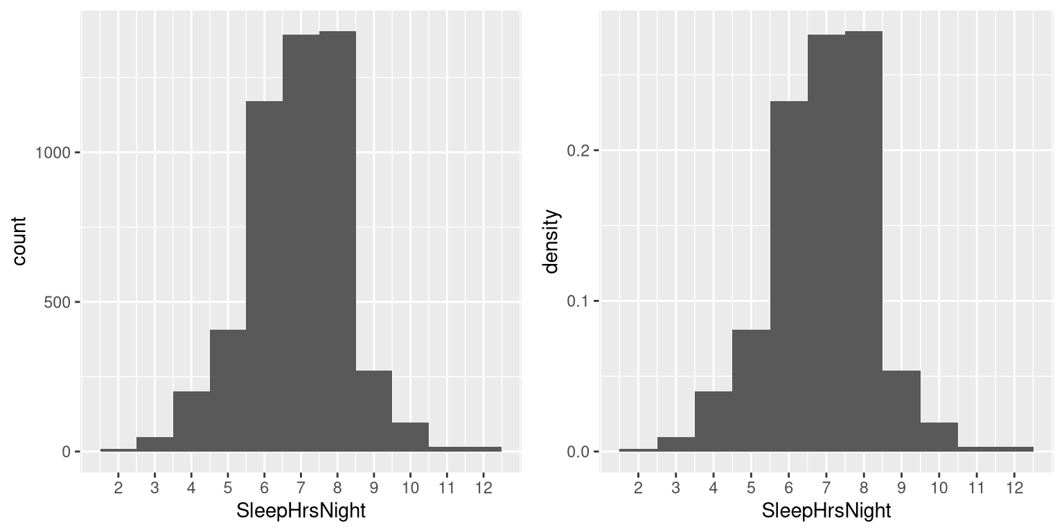
Figure 3.2: Left: Histogram showing the number (left) and proportion (right) of people reporting each possible value of the SleepHrsNight variable.
What if we want to know how many people report sleeping 5 hours or less? To find this, we can compute a cumulative distribution. To compute the cumulative frequency for some value j, we add up the frequencies for all of the values up to and including j:
\[ cumulative\ frequency_j = \sum_{i=1}^{j}{absolute\ frequency_i} \]
| SleepHrsNight | AbsoluteFrequency | CumulativeFrequency |
|---|---|---|
| 2 | 9 | 9 |
| 3 | 49 | 58 |
| 4 | 200 | 258 |
| 5 | 406 | 664 |
| 6 | 1172 | 1836 |
| 7 | 1394 | 3230 |
| 8 | 1405 | 4635 |
| 9 | 271 | 4906 |
| 10 | 97 | 5003 |
| 11 | 15 | 5018 |
| 12 | 17 | 5035 |
Let’s do this for our sleep variable, computing the absolute and cumulative frequency. In the left panel of Figure 3.3 we plot the data to see what these representations look like; the absolute frequency values are plotted in solid lines, and the cumulative frequencies are plotted in dashed lines We see that the cumulative frequency is monotonically increasing – that is, it can only go up or stay constant, but it can never decrease. Again, we usually find the relative frequencies to be more useful than the absolute; those are plotted in the right panel of Figure 3.3. Importantly, the shape of the relative frequency plot is exactly the same as the absolute frequency plot – only the size of the values has changed.
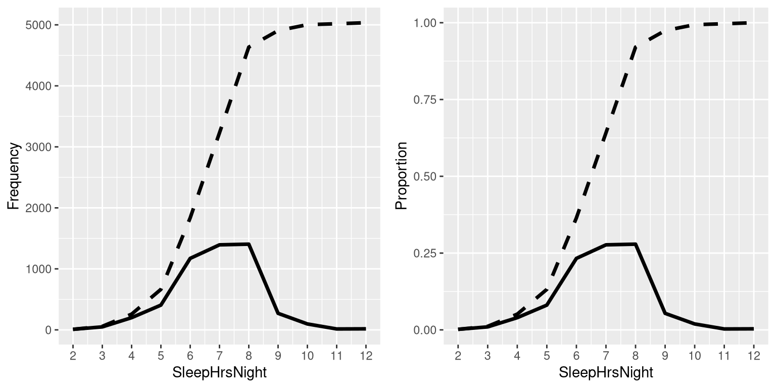
Figure 3.3: A plot of the relative (solid) and cumulative relative (dashed) values for frequency (left) and proportion (right) for the possible values of SleepHrsNight.
3.2.3 Plotting histograms
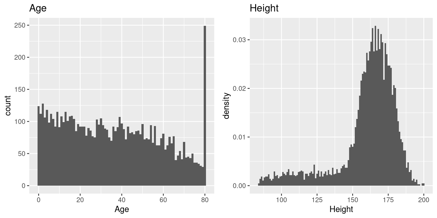
Figure 3.4: A histogram of the Age (left) and Height (right) variables in NHANES.
The variables that we examined above were fairly simple, having only a few possible values. Now let’s look at a more complex variable: Age. First let’s plot the Age variable for all of the individuals in the NHANES dataset (see left panel of Figure 3.4). What do you see there? First, you should notice that the number of individuals in each age group is declining over time. This makes sense because the population is being randomly sampled, and thus death over time leads to fewer people in the older age ranges. Second, you probably notice a large spike in the graph at age 80. What do you think that’s about?
If were were to look up the information about the NHANES dataset, we would see the following definition for the Age variable: “Age in years at screening of study participant. Note: Subjects 80 years or older were recorded as 80.” The reason for this is that the relatively small number of individuals with very high ages would make it potentially easier to identify the specific person in the dataset if you knew their exact age; researchers generally promise their participants to keep their identity confidential, and this is one of the things they can do to help protect their research subjects. This also highlights the fact that it’s always important to know where one’s data have come from and how they have been processed; otherwise we might interpret them improperly, thinking that 80-year-olds had been somehow overrepresented in the sample.
Let’s look at another more complex variable in the NHANES dataset: Height. The histogram of height values is plotted in the right panel of Figure 3.4. The first thing you should notice about this distribution is that most of its density is centered around about 170 cm, but the distribution has a “tail” on the left; there are a small number of individuals with much smaller heights. What do you think is going on here?
You may have intuited that the small heights are coming from the children in the dataset. One way to examine this is to plot the histogram with separate colors for children and adults (left panel of Figure 3.5). This shows that all of the very short heights were indeed coming from children in the sample. Let’s create a new version of NHANES that only includes adults, and then plot the histogram just for them (right panel of Figure 3.5). In that plot the distribution looks much more symmetric. As we will see later, this is a nice example of a normal (or Gaussian) distribution.
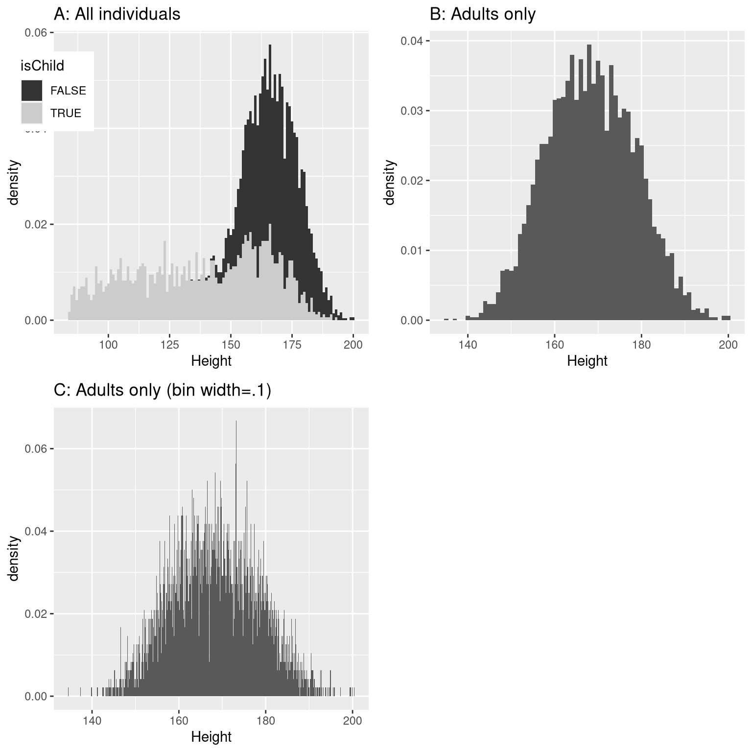
Figure 3.5: Histogram of heights for NHANES. A: values plotted separately for children (gray) and adults (black). B: values for adults only. C: Same as B, but with bin width = 0.1
3.2.4 Histogram bins
In our earlier example with the sleep variable, the data were reported in whole numbers, and we simply counted the number of people who reported each possible value. However, if you look at a few values of the Height variable in NHANES (as shown in Table 3.5), you will see that it was measured in centimeters down to the first decimal place.
| Height |
|---|
| 169.6 |
| 169.8 |
| 167.5 |
| 155.2 |
| 173.8 |
| 174.5 |
Panel C of Figure 3.5 shows a histogram that counts the density of each possible value down the first decimal place. That histogram looks really jagged, which is because of the variability in specific decimal place values. For example, the value 173.2 occurs 32 times, while the value 173.3 only occurs 15 times. We probably don’t think that there is really such a big difference between the prevalence of these two heights; more likely this is just due to random variability in our sample of people.
In general, when we create a histogram of data that are continuous or where there are many possible values, we will bin the values so that instead of counting and plotting the frequency of every specific value, we count and plot the frequency of values falling within specific ranges. That’s why the plot looked less jagged above in Panel B of 3.5; in this panel we set the bin width to 1, which means that the histogram is computed by combining values within bins with a width of one; thus, the values 1.3, 1.5, and 1.6 would all count toward the frequency of the same bin, which would span from values equal to one up through values less than 2.
Note that once the bin size has been selected, then the number of bins is determined by the data:
\[ number\, of\, bins = \frac{range\, of\, scores}{bin\, width} \]
There is no hard and fast rule for how to choose the optimal bin width. Occasionally it will be obvious (as when there are only a few possible values), but in many cases it would require trial and error. There are methods that try to find an optimal bin size automatically, such as the Freedman-Diaconis method that we will use in some later examples.
3.3 Idealized representations of distributions
Datasets are like snowflakes, in that every one is different, but nonetheless there are patterns that one often sees in different types of data. This allows us to use idealized representations of the data to further summarize them. Let’s take the adult height data plotted in 3.5, and plot them alongside a very different variable: pulse rate (heartbeats per minute), also measured in NHANES (see Figure 3.6).
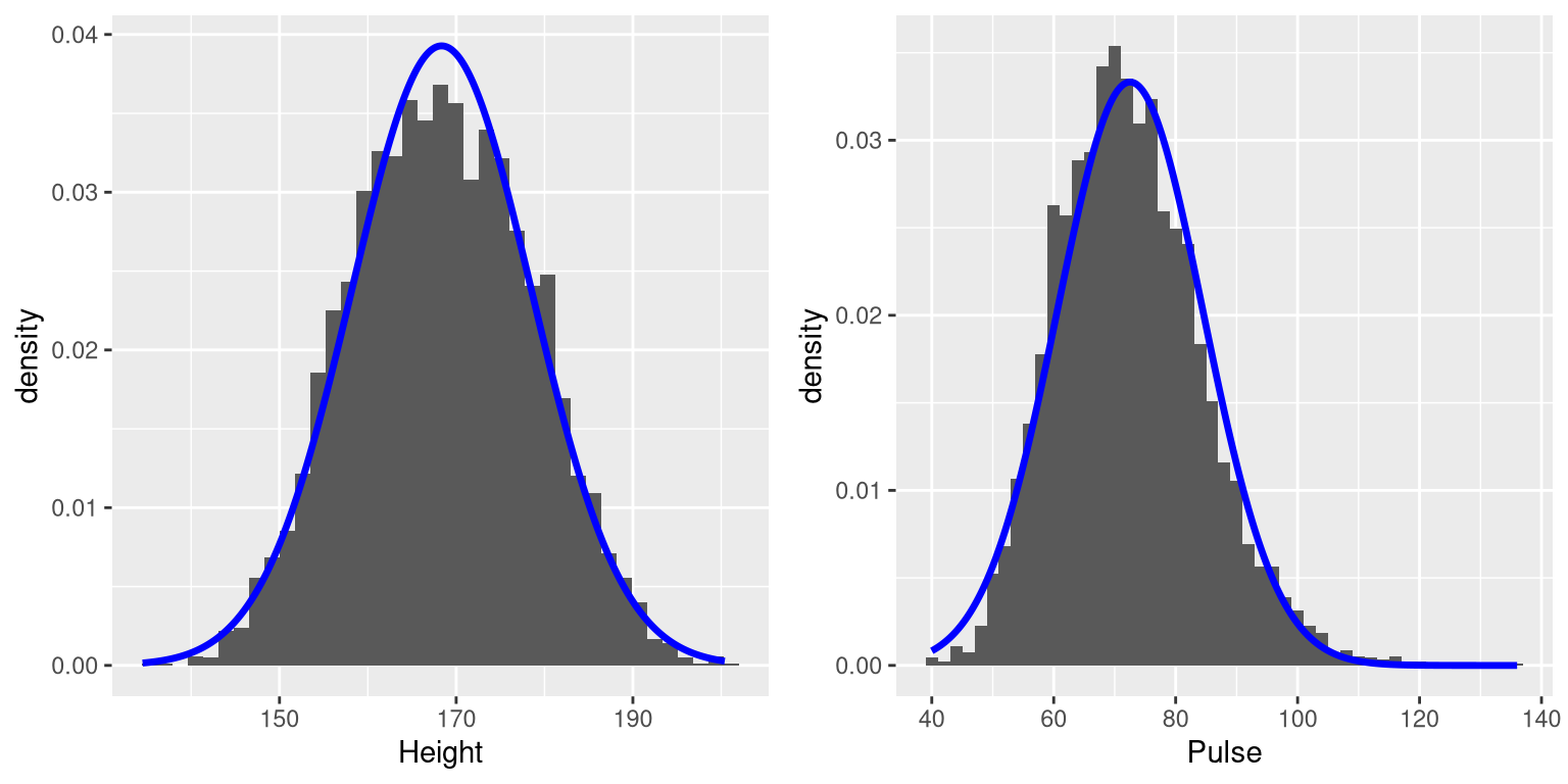
Figure 3.6: Histograms for height (left) and pulse (right) in the NHANES dataset, with the normal distribution overlaid for each dataset.
While these plots certainly don’t look exactly the same, both have the general characteristic of being relatively symmetric around a rounded peak in the middle. This shape is in fact one of the commonly observed shapes of distributions when we collect data, which we call the normal (or Gaussian) distribution. This distribution is defined in terms of two values (which we call parameters of the distribution): the location of the center peak (which we call the mean) and the width of the distribution (which is described in terms of a parameter called the standard deviation). Figure 3.6 shows the appropriate normal distribution plotted on top of each of the histrograms.You can see that although the curves don’t fit the data exactly, they do a pretty good job of characterizing the distribution – with just two numbers!
As we will see later when we discuss the central limit theorem, there is a deep mathematical reason why many variables in the world exhibit the form of a normal distribution.
3.3.1 Skewness
The examples in Figure 3.6 followed the normal distribution fairly well, but in many cases the data will deviate in a systematic way from the normal distribution. One way in which the data can deviate is when they are asymmetric, such that one tail of the distribution is more dense than the other. We refer to this as “skewness”. Skewness commonly occurs when the measurement is constrained to be non-negative, such as when we are counting things or measuring elapsed times (and thus the variable can’t take on negative values).
An example of relatively mild skewness can be seen in the average waiting times at the airport security lines at San Francisco International Airport, plotted in the left panel of Figure 3.7. You can see that while most wait times are less than 20 minutes, there are a number of cases where they are much longer, over 60 minutes! This is an example of a “right-skewed” distribution, where the right tail is longer than the left; these are common when looking at counts or measured times, which can’t be less than zero. It’s less common to see “left-skewed” distributions, but they can occur, for example when looking at fractional values that can’t take a value greater than one.
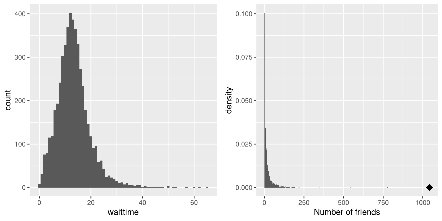
Figure 3.7: Examples of right-skewed and long-tailed distributions. Left: Average wait times for security at SFO Terminal A (Jan-Oct 2017), obtained from https://awt.cbp.gov/ . Right: A histogram of the number of Facebook friends amongst 3,663 individuals, obtained from the Stanford Large Network Database. The person with the maximum number of friends is indicated by the diamond.
3.3.2 Long-tailed distributions
Historically, statistics has focused heavily on data that are normally distributed, but there are many data types that look nothing like the normal distribution. In particular, many real-world distributions are “long-tailed”, meaning that the right tail extends far beyond the most typical members of the distribution; that is, they are extremely skewed. One of the most interesting types of data where long-tailed distributions occur arises from the analysis of social networks. For an example, let’s look at the Facebook friend data from the Stanford Large Network Database and plot the histogram of number of friends across the 3,663 people in the database (see right panel of Figure 3.7). As we can see, this distribution has a very long right tail – the average person has 24.09 friends, while the person with the most friends (denoted by the blue dot) has 1043!
Long-tailed distributions are increasingly being recognized in the real world. In particular, many features of complex systems are characterized by these distributions, from the frequency of words in text, to the number of flights in and out of different airports, to the connectivity of brain networks. There are a number of different ways that long-tailed distributions can come about, but a common one occurs in cases of the so-called “Matthew effect” from the Christian Bible:
For to every one who has will more be given, and he will have abundance; but from him who has not, even what he has will be taken away. — Matthew 25:29, Revised Standard Version
This is often paraphrased as “the rich get richer”. In these situations, advantages compound, such that those with more friends have access to even more new friends, and those with more money have the ability to do things that increase their riches even more.
As the course progresses we will see several examples of long-tailed distributions, and we should keep in mind that many of the tools in statistics can fail when faced with long-tailed data. As Nassim Nicholas Taleb pointed out in his book “The Black Swan”, such long-tailed distributions played a critical role in the 2008 financial crisis, because many of the financial models used by traders assumed that financial systems would follow the normal distribution, which they clearly did not.
3.4 Learning objectives
Having read this chapter, you should be able to:
- Compute absolute, relative, and cumulative frequency distributions for a given dataset
- Generate a graphical representation of a frequency distribution
- Describe the difference between a normal and a long-tailed distribution, and describe the situations that commonly give rise to each