Chapter 13 Modeling continuous relationships
Most people are familiar with the concept of correlation, and in this chapter we will provide a more formal understanding for this commonly used and misunderstood concept.
13.1 An example: Hate crimes and income inequality
In 2017, the web site Fivethirtyeight.com published a story titled Higher Rates Of Hate Crimes Are Tied To Income Inequality which discussed the relationship between the prevalence of hate crimes and income inequality in the wake of the 2016 Presidential election. The story reported an analysis of hate crime data from the FBI and the Southern Poverty Law Center, on the basis of which they report:
“we found that income inequality was the most significant determinant of population-adjusted hate crimes and hate incidents across the United States”.
The data for this analysis are available as part the fivethirtyeight package for the R statistical software, which makes it easy for us to access them. The analysis reported in the story focused on the relationship between income inequality (defined by a quantity called the Gini index — see Appendix for more details) and the prevalence of hate crimes in each state.
13.2 Is income inequality related to hate crimes?
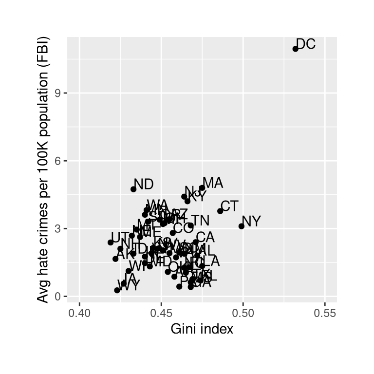
Figure 13.1: Plot of rates of hate crimes vs. Gini index.
The relationship between income inequality and rates of hate crimes is shown in Figure 13.1. Looking at the data, it seems that there may be a positive relationship between the two variables. How can we quantify that relationship?
13.3 Covariance and correlation
One way to quantify the relationship between two variables is the covariance. Remember that variance for a single variable is computed as the average squared difference between each data point and the mean:
\[ s^2 = \frac{\sum_{i=1}^n (x_i - \bar{x})^2}{N - 1} \]
This tells us how far each observation is from the mean, on average, in squared units. Covariance tells us whether there is a relation between the deviations of two different variables across observations. It is defined as:
\[ covariance = \frac{\sum_{i=1}^n (x_i - \bar{x})(y_i - \bar{y})}{N - 1} \]
This value will be far from zero when individual data points deviate by similar amounts from their respective means; if they are deviant in the same direction then the covariance is positive, whereas if they are deviant in opposite directions the covariance is negative. Let’s look at a toy example first. The data are shown in Table 13.1, along with their individual deviations from the mean and their crossproducts.
| x | y | y_dev | x_dev | crossproduct |
|---|---|---|---|---|
| 3 | 5 | -3.6 | -4.6 | 16.56 |
| 5 | 4 | -4.6 | -2.6 | 11.96 |
| 8 | 7 | -1.6 | 0.4 | -0.64 |
| 10 | 10 | 1.4 | 2.4 | 3.36 |
| 12 | 17 | 8.4 | 4.4 | 36.96 |
The covariance is simply the mean of the crossproducts, which in this case is 17.05. We don’t usually use the covariance to describe relationships between variables, because it varies with the overall level of variance in the data. Instead, we would usually use the correlation coefficient (often referred to as Pearson’s correlation after the statistician Karl Pearson). The correlation is computed by scaling the covariance by the standard deviations of the two variables:
\[ r = \frac{covariance}{s_xs_y} = \frac{\sum_{i=1}^n (x_i - \bar{x})(y_i - \bar{y})}{(N - 1)s_x s_y} \] In this case, the value is 0.89. The correlation coefficient is useful because it varies between -1 and 1 regardless of the nature of the data - in fact, we already discussed the correlation coefficient earlier in our discussion of effect sizes. As we saw in that previous chapter, a correlation of 1 indicates a perfect linear relationship, a correlation of -1 indicates a perfect negative relationship, and a correlation of zero indicates no linear relationship.
13.3.1 Hypothesis testing for correlations
The correlation value of 0.42 between hate crimes and income inequality seems to indicate a reasonably strong relationship between the two, but we can also imagine that this could occur by chance even if there is no relationship. We can test the null hypothesis that the correlation is zero, using a simple equation that lets us convert a correlation value into a t statistic:
\[ \textit{t}_r = \frac{r\sqrt{N-2}}{\sqrt{1-r^2}} \]
Under the null hypothesis \(H_0:r=0\), this statistic is distributed as a t distribution with \(N - 2\) degrees of freedom. We can compute this using our statistical software:
##
##  Pearson's product-moment correlation
##
## data:  hateCrimes$avg_hatecrimes_per_100k_fbi and hateCrimes$gini_index
## t = 3, df = 48, p-value = 0.002
## alternative hypothesis: true correlation is not equal to 0
## 95 percent confidence interval:
##  0.16 0.63
## sample estimates:
##  cor
## 0.42
This test shows that the likelihood of an r value this extreme or more is quite low under the null hypothesis, so we would reject the null hypothesis of \(r=0\). Note that this test assumes that both variables are normally distributed.
We could also test this by randomization, in which we repeatedly shuffle the values of one of the variables and compute the correlation, and then compare our observed correlation value to this null distribution to determine how likely our observed value would be under the null hypothesis. The results are shown in Figure 13.2. The p-value computed using randomization is reasonably similar to the answer given by the t-test.
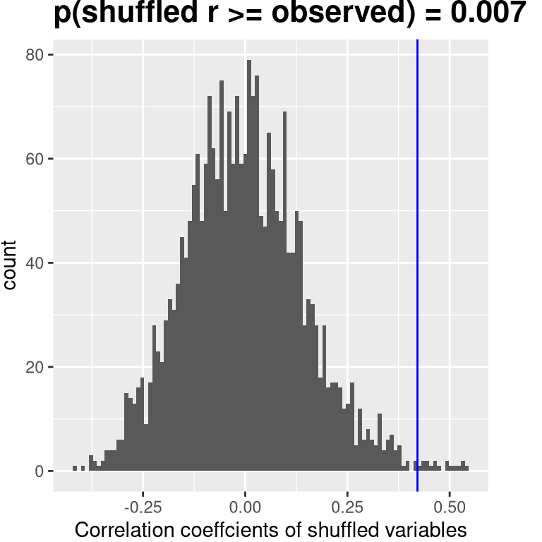
Figure 13.2: Histogram of correlation values under the null hypothesis, obtained by shuffling values. Observed value is denoted by blue line.
We could also use Bayesian inference to estimate the correlation; see the Appendix for more on this.
13.3.2 Robust correlations
You may have noticed something a bit odd in Figure 13.1 – one of the datapoints (the one for the District of Columbia) seemed to be quite separate from the others. We refer to this as an outlier, and the standard correlation coefficient is very sensitive to outliers. For example, in Figure 13.3 we can see how a single outlying data point can cause a very high positive correlation value, even when the actual relationship between the other data points is perfectly negative.
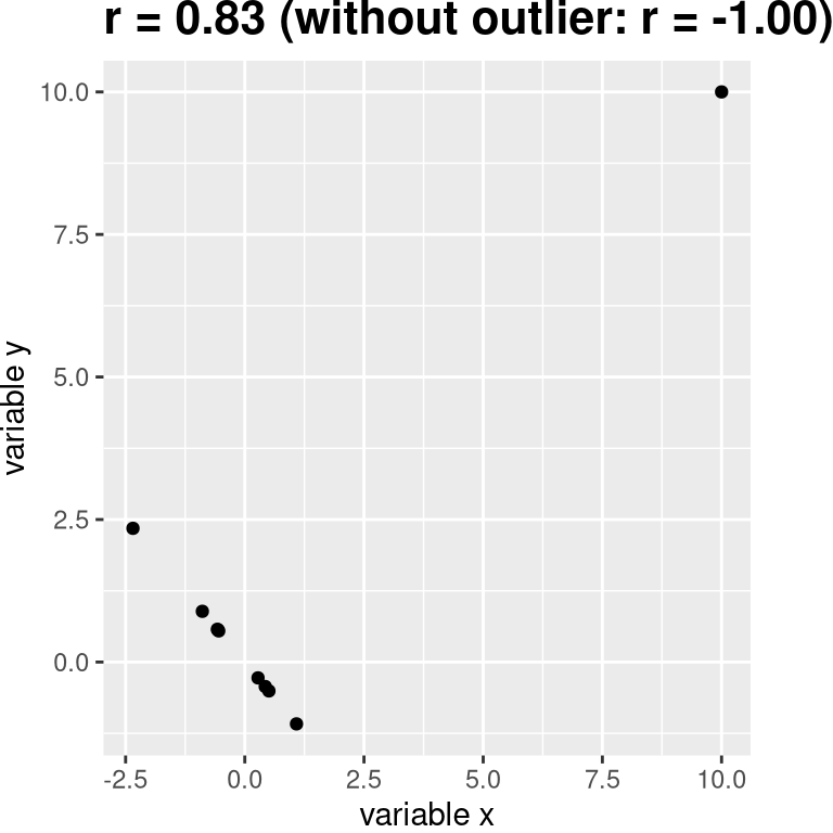
Figure 13.3: An simulated example of the effects of outliers on correlation. Without the outlier the remainder of the datapoints have a perfect negative correlation, but the single outlier changes the correlation value to highly positive.
One way to address outliers is to compute the correlation on the ranks of the data after ordering them, rather than on the data themselves; this is known as the Spearman correlation. Whereas the Pearson correlation for the example in Figure 13.3 was 0.83, the Spearman correlation is -0.45, showing that the rank correlation reduces the effect of the outlier and reflects the negative relationship between the majority of the data points.
We can compute the rank correlation on the hate crime data as well:
##
##  Spearman's rank correlation rho
##
## data:  hateCrimes$avg_hatecrimes_per_100k_fbi and hateCrimes$gini_index
## S = 20146, p-value = 0.8
## alternative hypothesis: true rho is not equal to 0
## sample estimates:
##   rho
## 0.033
Now we see that the correlation is no longer significant (and in fact is very near zero), suggesting that the claims of the FiveThirtyEight blog post may have been incorrect due to the effect of the outlier.
13.4 Correlation and causation
When we say that one thing causes another, what do we mean? There is a long history in philosophy of discussion about the meaning of causality, but in statistics one way that we commonly think of causation is in terms of experimental control. That is, if we think that factor X causes factor Y, then manipulating the value of X should also change the value of Y.
In medicine, there is a set of ideas known as Koch’s postulates which have historically been used to determine whether a particular organism causes a disease. The basic idea is that the organism should be present in people with the disease, and not present in those without it – thus, a treatment that eliminates the organism should also eliminate the disease. Further, infecting someone with the organism should cause them to contract the disease. An example of this was seen in the work of Dr. Barry Marshall, who had a hypothesis that stomach ulcers were caused by a bacterium (Helicobacter pylori). To demonstrate this, he infected himself with the bacterium, and soon thereafter developed severe inflammation in his stomach. He then treated himself with an antibiotic, and his stomach soon recovered. He later won the Nobel Prize in Medicine for this work.
Often we would like to test causal hypotheses but we can’t actually do an experiment, either because it’s impossible (“What is the relationship between human carbon emissions and the earth’s climate?”) or unethical (“What are the effects of severe abuse on child brain development?”). However, we can still collect data that might be relevant to those questions. For example, we can potentially collect data from children who have been abused as well as those who have not, and we can then ask whether their brain development differs.
Let’s say that we did such an analysis, and we found that abused children had poorer brain development than non-abused children. Would this demonstrate that abuse causes poorer brain development? No. Whenever we observe a statistical association between two variables, it is certainly possible that one of those two variables causes the other. However, it is also possible that both of the variables are being influenced by a third variable; in this example, it could be that child abuse is associated with family stress, which could also cause poorer brain development through less intellectual engagement, food stress, or many other possible avenues. The point is that a correlation between two variables generally tells us that something is probably causing somethign else, but it doesn’t tell us what is causing what.
13.4.1 Causal graphs
One useful way to describe causal relations between variables is through a causal graph, which shows variables as circles and causal relations between them as arrows. For example, Figure 13.4 shows the causal relationships between study time and two variables that we think should be affected by it: exam grades and exam finishing times.
However, in reality the effects on finishing time and grades are not due directly to the amount of time spent studying, but rather to the amount of knowledge that the student gains by studying. We would usually say that knowledge is a latent variable – that is, we can’t measure it directly but we can see it reflected in variables that we can measure (like grades and finishing times). Figure 13.5 shows this.
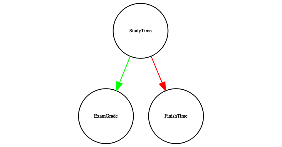
Figure 13.4: A graph showing causal relationships between three variables: study time, exam grades, and exam finishing time. A green arrow represents a positive relationship (i.e. more study time causes exam grades to increase), and a red arrow represents a negative relationship (i.e. more study time causes faster completion of the exam).
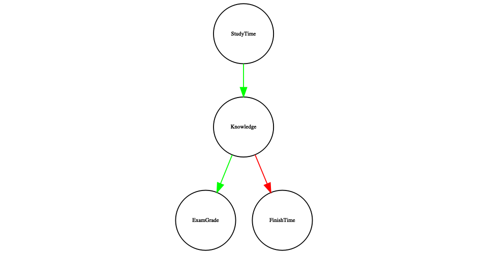
Figure 13.5: A graph showing the same causal relationships as above, but now also showing the latent variable (knowledge) using a square box.
Here we would say that knowledge mediates the relationship between study time and grades/finishing times. That means that if we were able to hold knowledge constant (for example, by administering a drug that causes immediate forgetting), then the amount of study time should no longer have an effect on grades and finishing times.
Note that if we simply measured exam grades and finishing times we would generally see negative relationship between them, because people who finish exams the fastest in general get the highest grades. However, if we were to interpret this correlation as a causal relation, this would tell us that in order to get better grades, we should actually finish the exam more quickly! This example shows how tricky the inference of causality from non-experimental data can be.
Within statistics and machine learning, there is a very active research community that is currently studying the question of when and how we can infer causal relationships from non-experimental data. However, these methods often require strong assumptions, and must generally be used with great caution.
13.5 Learning objectives
After reading this chapter, you should be able to:
- Describe the concept of the correlation coefficient and its interpretation
- Compute the correlation between two continuous variables
- Describe the effect of outlier data points and how to address them.
- Describe the potential causal influences that can give rise to an observed correlation.
13.6 Suggested readings
- The Book of Why by Judea Pearl - an excellent introduction to the ideas behind causal inference.
13.7 Appendix:
13.7.1 Quantifying inequality: The Gini index
Before we look at the analysis reported in the story, it’s first useful to understand how the Gini index is used to quantify inequality. The Gini index is usually defined in terms of a curve that describes the relation between income and the proportion of the population that has income at or less than that level, known as a Lorenz curve. However, another way to think of it is more intuitive: It is the relative mean absolute difference between incomes, divided by two (from https://en.wikipedia.org/wiki/Gini_coefficient):
\[ G = \frac{\displaystyle{\sum_{i=1}^n \sum_{j=1}^n \left| x_i - x_j \right|}}{\displaystyle{2n\sum_{i=1}^n x_i}} \]
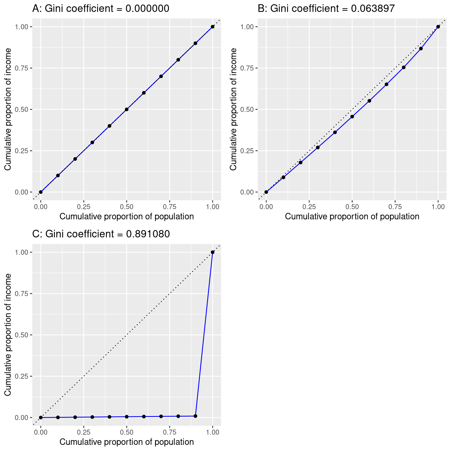
Figure 13.6: Lorenz curves for A) perfect equality, B) normally distributed income, and C) high inequality (equal income except for one very wealthy individual).
Figure 13.6 shows the Lorenz curves for several different income distributions. The top left panel (A) shows an example with 10 people where everyone has exactly the same income. The length of the intervals between points are equal, indicating each person earns an identical share of the total income in the population. The top right panel (B) shows an example where income is normally distributed. The bottom left panel shows an example with high inequality; everyone has equal income ($40,000) except for one person, who has income of $40,000,000. According to the US Census, the United States had a Gini index of 0.469 in 2010, falling roughly half way between our normally distributed and maximally inequal examples.
13.7.2 Bayesian correlation analysis
We can also analyze the FiveThirtyEight data using Bayesian analysis, which has two advantages. First, it provides us with a posterior probability – in this case, the probability that the correlation value exceeds zero. Second, the Bayesian estimate combines the observed evidence with a prior, which has the effect of regularizing the correlation estimate, effectively pulling it towards zero. Here we can compute it using BayesFactor package in R.
## Bayes factor analysis
## --------------
## [1] Alt., r=0.333 : 21 ±0%
##
## Against denominator:
##   Null, rho = 0
## ---
## Bayes factor type: BFcorrelation, Jeffreys-beta*
## Summary of Posterior Distribution
##
## Parameter | Median | 95% CI | pd | ROPE | % in ROPE | BF | Prior
## ----------------------------------------------------------------------------------------------
## rho | 0.38 | [0.13, 0.58] | 99.88% | [-0.05, 0.05] | 0% | 20.85 | Beta (3 +- 3)Notice that the correlation estimated using the Bayesian method (0.38) is slightly smaller than the one estimated using the standard correlation coefficient (0.42), which is due to the fact that the estimate is based on a combination of the evidence and the prior, which effectively shrinks the estimate toward zero. However, notice that the Bayesian analysis is not robust to the outlier, and it still says that there is fairly strong evidence that the correlation is greater than zero (with a Bayes factor of more than 20).